
While Trello is great for visualizing and managing projects, generating reports can be challenging due to its limited reporting features and lack of customization.
Looking for a way to create faster and simpler reports? In this article, you’ll learn how to make Trello reporting more efficient, including how to leverage native and third-party solutions, the role of automation, and tools for designing custom reports.
Trello reporting options
There are different Trello reporting options to choose from, varying from native features to power-ups and third-party solutions. There are even data integration solutions that allow you to create self-updating Trello reports in interactive dashboards.
Here are the different reporting options with their pros and cons:
- Built-in reporting features – Trello’s dashboard-building feature allows you to create basic reports to evaluate team and project performance. However, these are only available for Premium Trello users. Also, unlike the other options, the dashboard functionality is limited. For example, you can’t conduct detailed analytics or customize your reports.
- Trello Reporting power-ups – You can choose from over 70 power-ups to enhance native functionality. Many are free and come with features like automated dashboards, customizable charts, and time-tracking analytics. However, some power-ups may be unreliable or experience downtime, which can impact team productivity and project progress.
- Third-party solutions – Coupler.io and other data analytics solutions let you automate data collection and create complex reports. This method might be a better option if you need to aggregate data from multiple sources, not just Trello. But some products may require a subscription fee.
Built-in reporting features in Trello
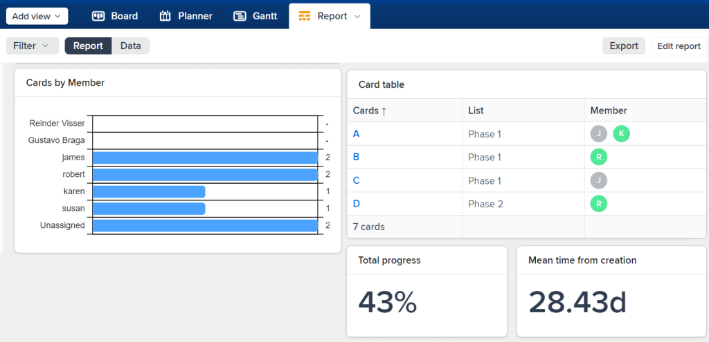
Trello’s Dashboards feature is an easy-to-use, built-in option for Premium users. On your workspace in Trello, you will find a dropdown menu next to Board where you can select a different view.
With the Dashboard view, team leaders can easily visualize data within seconds. To make it easier for managers to evaluate the workload of their team, Trello comes with four charts based on card counts per filter:
- Cards per list
- Cards per member
- Cards per label
- Cards per due date status

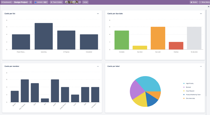
Premium users can customize the information that appears on the dashboard by simply removing or adding charts. Also, for better visualization, you can choose to see the data in a bar graph or pie chart.
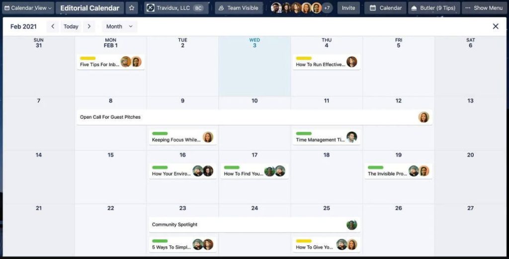
While this is the most advanced built-in feature for reporting for Trello, you can also choose a different feature such as Calendar view. Trello’s calendar view allows you to see all tasks and deadlines in a calendar format, making it easy to identify upcoming due dates and potential scheduling conflicts.

It’s important to note that these features are only available if you have a Premium account. If you are looking for a free option, let’s move to the next option for reporting in Trello.
Trello reporting power-ups
One of the great things about Trello is that it comes with additional apps or tools, known as power-ups. There are many Trello reporting power-ups designed to help you keep track of your objectives and measure the performance of your team. The power-ups can be found at the top right on your workspace in Trello.
Here are some of the best Trello power-ups for reporting and analytics.
1. Analytics and reports by Screenful
Analytics and reports by Screenful is a power-up that lets you create custom charts with your Trello data. You can then design automated reports by compiling your charts into a unified view.

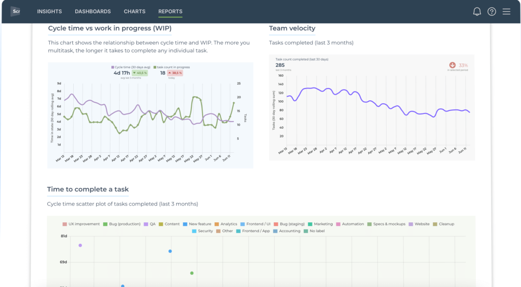
With this power-up, you can create forecasting charts to track progress towards a milestone, burndown charts to assess the tasks completed in a sprint, or a task list chart to quickly assess who’s working on what. The 15+ charts are available as customizable templates.
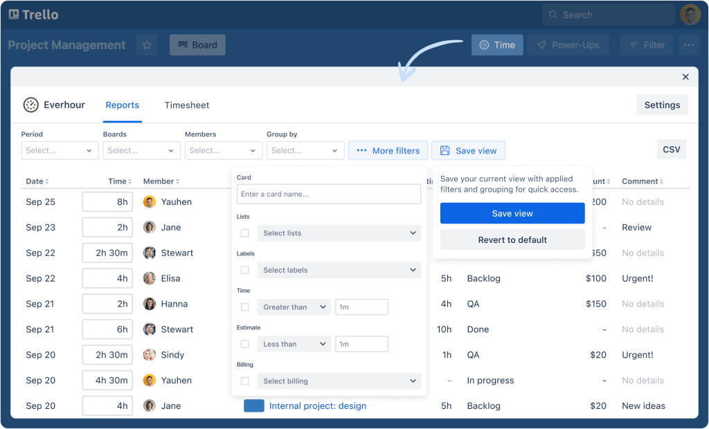
2. Time-tracking power-up by Everhour
Everhour provides a time-tracking power-up for Trello Cards that is both 100% free and lightweight. This easy-to-set-up power-up helps you discover how much time is spent per card. In the card details, you can track time using a timer or log time manually for any date.

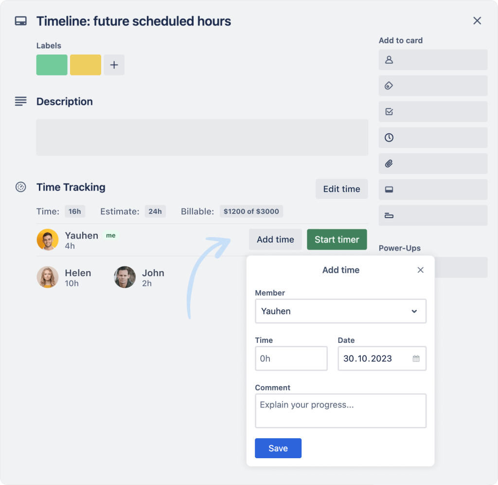
The power-up comes with a dedicated reporting feature. To view a complete record of time entries, select the “Time” button from the menu, and you’ll get a detailed breakdown of what tasks your team has worked on and for how long.

With the time-tracking power-up by Everhour you can:
- Track the amount of time spent on each task to create better project forecasts.
- Optimize resource management by adding billable rates to cards. You can calculate and keep track of the budget for individual tasks.
- Create project reports which can be filtered by period, boards, members, and more.
- Use the Timesheet tab to review weekly reported time and spot opportunities for improved efficiency.
- Share your reports with stakeholders with the CSV export feature.
3. Reports by Blue Cat
Reports by Blue Cat is a power-up for Trello that lets you create a top-level view of your Trello Boards. You can generate fully customizable reports to analyze team productivity and capacity. These reports also help your team keep track of tasks spread across multiple boards.

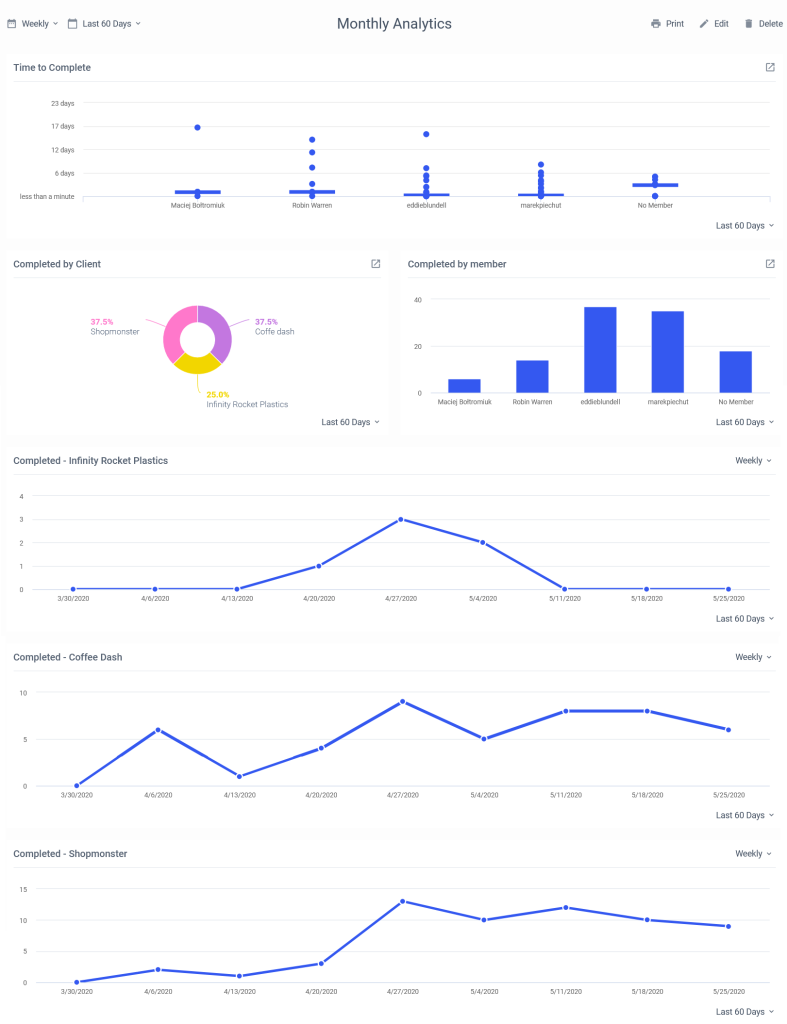
The reports boast several chart options, including pie, bar, time to complete, etc. You can also filter card and checklist items by board, list, label, members, etc.
For instance, you could create a monthly analytics report to assess how quickly your team completes tasks, pinpoint the most productive team members, and identify the fastest-moving projects.
What else can you do with the Blue Cat reports:
- Create team or project summary reports to evaluate team velocity, analyze project resources, and follow up on overdue tasks.
- Quickly identify team priorities and blockers with a top-down view.
- Get the reports emailed to you or other stakeholders on a schedule.
This power-up isn’t free, but it offers a 7-day free trial followed by a $4 per month subscription.
Of course, apart from these power-ups, you can also choose from a wide range of Trello reporting free and paid power-ups. Looking for a way to create more customizable and easy-to-visualize reports? Here comes the third Trello reporting option.
Tools for custom Trello reporting
Automated reporting tools come with many benefits. They allow you to save time on regular reporting tasks, minimize human error, and make your reporting process smooth and effortless thanks to building self-updating reports and visualizations.
1. Coupler.io
Coupler.io is a reporting automation and analytics platform that allows you to collect, visualize, and analyze your data – no technical knowledge required. With just a few clicks, you can connect your Trello data to a BI tool and create custom project management reports.

Extract data from 60+ apps (e.g. Trello, Airtable, Asana) and load it to your preferred BI tool, such as Looker Studio, Power BI, or Tableau. By visualizing data from Trello and other sources in a single dashboard, you can make data-driven decisions on how to optimize team and project performance.
Coupler.io’s automatic data refresh feature also ensures your Trello dashboard updates on a schedule (e.g. hourly, daily, weekly). No need for manual data exports, CSV uploads, or hard-coded solutions!
2. Bridge24
Bridge24 is a reporting and exporting tool that can be used to create complex Trello reports. With Bridge24, you can present data in different views such as a grid or calendar. This gives you a bird’s eye view of project progress, including due dates, card status, and checklist completion.

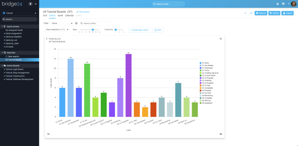
You can automatically create interactive reports with popular charts, including cards by the board, member, status type, or list. Use different types of graphics – pie, donut, polar, and bar charts – to organize data and understand the factors impacting performance.
It’s also possible to stack your charts and conduct drill-down analyses by clicking on a segment in the chart. This will open the card in edit mode for quick adjustments.
As a bonus, Bridge24 allows you to easily export data in Excel or CSV format for backup or presentation purposes.
3. Hevo
Another option that allows you to extract data from Trello is Hevo. With Hevo, it’s easy to automate your Trello reporting and create dashboards to analyze your project performance.

Like Coupler.io, Hevo is a no-code solution that can be used by people without a technical background. Hevo allows you to load data from Trello to any data warehouse. You can export data from Trello to your preferred destination and then create reports in Looker Studio or other business data visualization tools.
How to automate Trello reporting with Coupler.io
If you want to create an intuitive report that exceeds Trello’s native reporting or power-up abilities, that’s where Coupler.io comes in. The process is easy and doesn’t require coding. All you need to do is follow this step-by-step Coupler.io tutorial and you’ll generate a report in minutes.
Select the destination app for your custom Trello report in the form below and click Proceed.

You’ll be offered to create a Coupler.io account for free with no credit card required.
1. Collect Trello data
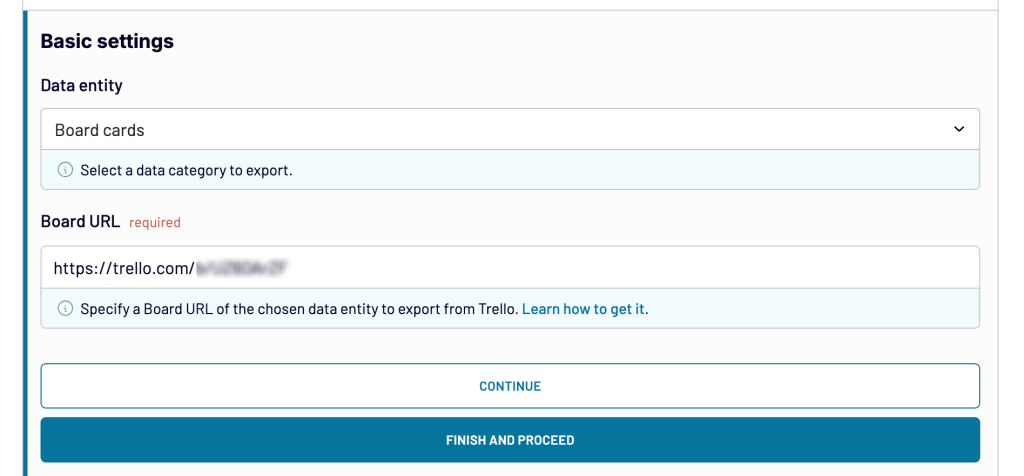
At the next step, choose and authorize your source account, then specify the Trello data you would like to visualize in a report. This will include:
- Picking a data entity: Board cards, card updates, or checklist items.
- Entering the board URL, which you can find in the Trello interface. Go to your chosen board and click on the three dots in the upper-right corner. Select Print, export, & share, then copy and paste the URL back into Coupler.io.

- Configuring any advanced settings (columns, date period).
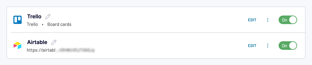
Before you proceed to the Transformations, you’ll have the option to add another data source.
For instance, let’s say you want to create a report with product management data from Trello and Airtable. Simply choose Airtable as a second source, configure basic settings, and continue. We’ll do exactly that to show you how it can work.

2. Transform and organize data
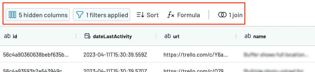
Now, onto the Transformations step. This is where you can make changes to your Trello data before visualizing it. For example, you can:
- Filter and sort data
- Edit, rename, hide, or reorder columns
- Add new columns with custom parameters
- Blend data from multiple Trello accounts or other apps.

In this case, we’ll use the Join function to merge data from the two apps, Trello and Airtable. It allows you to blend data from differently-named fields and ensure consistency in the final dashboard view.

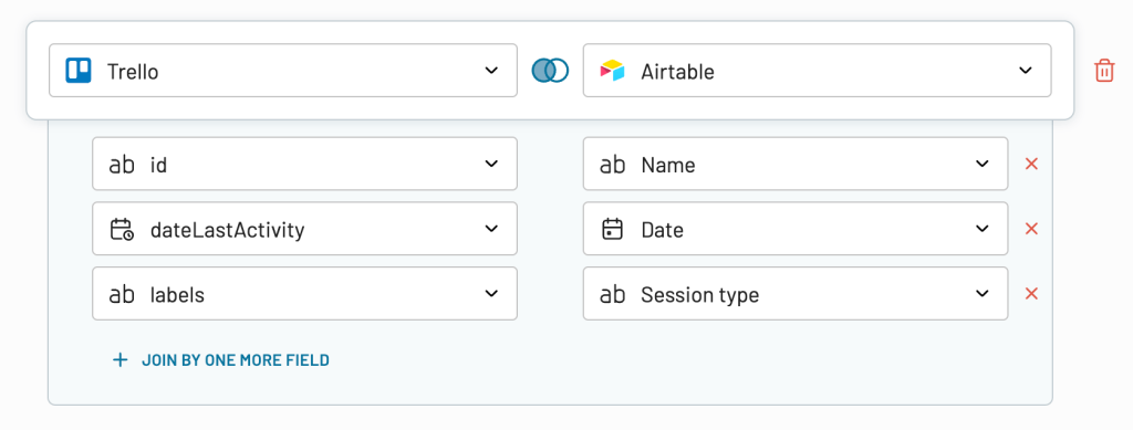
Specify the fields you want to join, review the final table, and then proceed to the Destinations step.
3. Load data and schedule automatic data refreshes
If you set up the integration using the form above, you need to select the destination there but you can change it if necessary. Coupler.io supports 11 destinations, such as Looker Studio, Tableau, or Google Sheets. Follow the in-app instructions to connect your destination and load the Trello report in it.
If you plan to design a simple, highly visual report, it’s better to go with a tool like Looker Studio. It’s free to use and offers a wide range of graphics, such as bar, pie, line charts, and pivot tables. After choosing Looker Studio, you’ll be prompted to generate a data source in the external app. Follow the instructions to finalize your report.
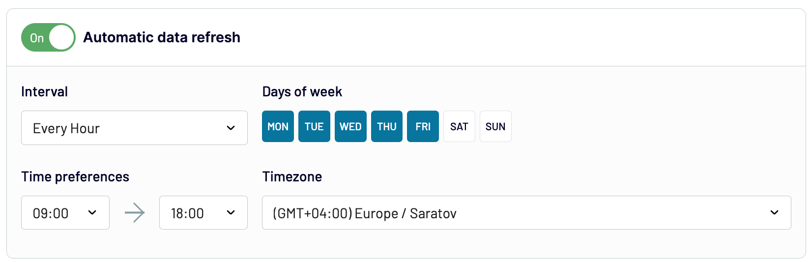
Back in Coupler.io, don’t forget to switch on automatic updates. Click Set Up Schedule to ensure your report updates regularly, such as daily, weekly, or as often as every 15 minutes. Also, select the days of the week when you would want Coupler.io to extract data, the time preference, and the timezone. Then, click on Save and Run Importer.

That’s it, you now have a Trello report that updates on a schedule!
Rather build your report in a spreadsheet? Then you can integrate Trello with Google Sheets. If you are dealing with large datasets, you may want to review your options for Trello to BigQuery integration.
Types of Trello reports to track progress and performance
Every team and every project is different. That’s why there are various ways in which you can report in Trello. Here are some of the most common Trello reports that will help you track productivity and improve time management.
Trello Time Reporting
This reporting type refers to the practice of tracking the time spent on tasks and activities within Trello. This allows users to gain insights into how time is being allocated across different projects and tasks, and can help with project planning, team management, and productivity analysis.
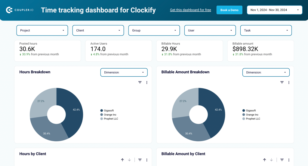
Take advantage of the power-ups for time-tracking apps such as Clockify, Harvest, or Timecamp. This will let you track time directly in Trello and automatically sync data with the other app. You can then export that data for analysis in a dashboard, using free templates like this Clockify time tracking dashboard by Coupler.io to analyze productivity.

Trello Project Reporting
Project reporting can help teams identify areas that require attention, measure progress against goals, and communicate project status to stakeholders.
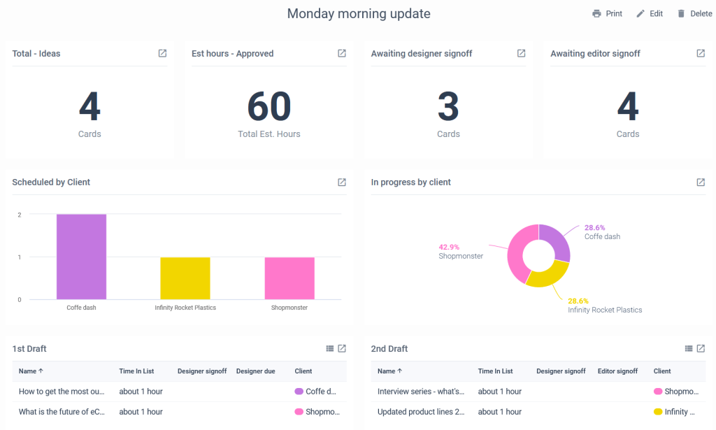
For instance, you can create basic reports that provide a quick overview of cards status, like this one with the Placker power up:

Or more sophisticated project status reports like this one with the Blue Cat reports power up. A report like this allows you to track the progress of marketing projects for each client and identify blockers at a glance.

Trello Board Reporting
Board reporting can help teams track the progress of each card, identify bottlenecks and areas for improvement, and communicate board status to stakeholders.
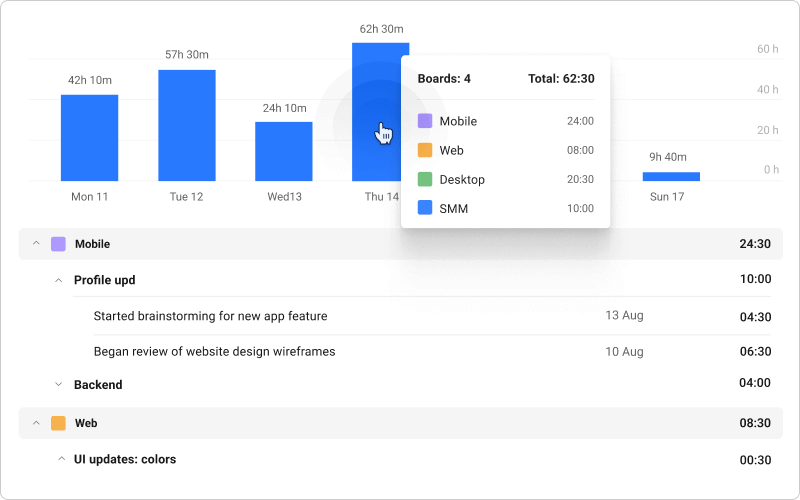
Here’s an example of a simple board report you can create with the Planyway power up. It provides a brief overview of the time spent working on tasks in each board, so you can understand which project consumes the most team resources.

Trello Reporting Analytics
This refers to the use of data analysis tools and techniques to generate insights and identify patterns in Trello data. By analyzing Trello data, users can gain insights into how their teams are performing, identify trends over time, and make data-driven decisions. Trello reporting analytics is applicable to all types of Trello reports.
Keep in mind that you can only perform advanced analytics with external tools like Coupler.io. While power-ups are great tools, they often lack the capabilities needed for more complex data analysis tasks, such as comparisons, drill-downs, etc.
Best practices for Trello reporting
Consistent use of labels. Using labels consistently across all cards and boards can help with filtering and sorting data for reporting purposes. Make sure everyone on the team is on the same page about the meaning and use of different labels.
Regularly update card information. Make sure card information, such as due dates, checklists, and attachments, is regularly updated to ensure accuracy in reporting.
Utilize power-ups or apps. Trello power-ups can extend Trello’s reporting capabilities, so take advantage of them. Research and experiment with different power-ups to find ones that work best for your reporting needs.
Automate the process. By using tools like Coupler.io, you can automate reporting in Trello. Instead of creating weekly/monthly reports manually, you can use Coupler.io to automatically export data to your preferred destination file. With the scheduled updates, your reports can always be up to date.
Analyze data regularly. Analyzing data on an ongoing basis can help teams identify trends, patterns, and areas for improvement. Use Trello reporting tools to extract these insights and take action based on them.
Reporting for Trello: keep track of your performance
Trello reporting provides valuable insights into team performance and project progress. By utilizing Trello’s reporting features and power-ups, you can easily track time, analyze project data, and generate custom reports to keep stakeholders informed.
Following best practices such as using consistent labels, regularly updating card information, and automating reporting can ensure accuracy and clarity in reports. By regularly analyzing data, you can identify trends and areas for improvement, leading to better project outcomes.