Web analytics dashboards are important tools for monitoring your business successes. The main question that most people might ask themselves is what web analytics dashboard to choose. There are dozens upon dozens of different solutions on the market, and trying to figure out what will produce the best result is a long process.
In this article, we share a brief overview of the best web analytics dashboards and add a few tips on using them to ensure long-term success.
Top 12 web analytics dashboard examples
Here are the 12 best web analytics dashboards that can make your marketing team’s job easier and inform other departments about your marketing effort performance. Each entry is accompanied by screenshots of dashboard examples and a brief explanation of what this marketing dashboard can do for you and how much it costs.
1. Web analytics dashboard template by Coupler.io
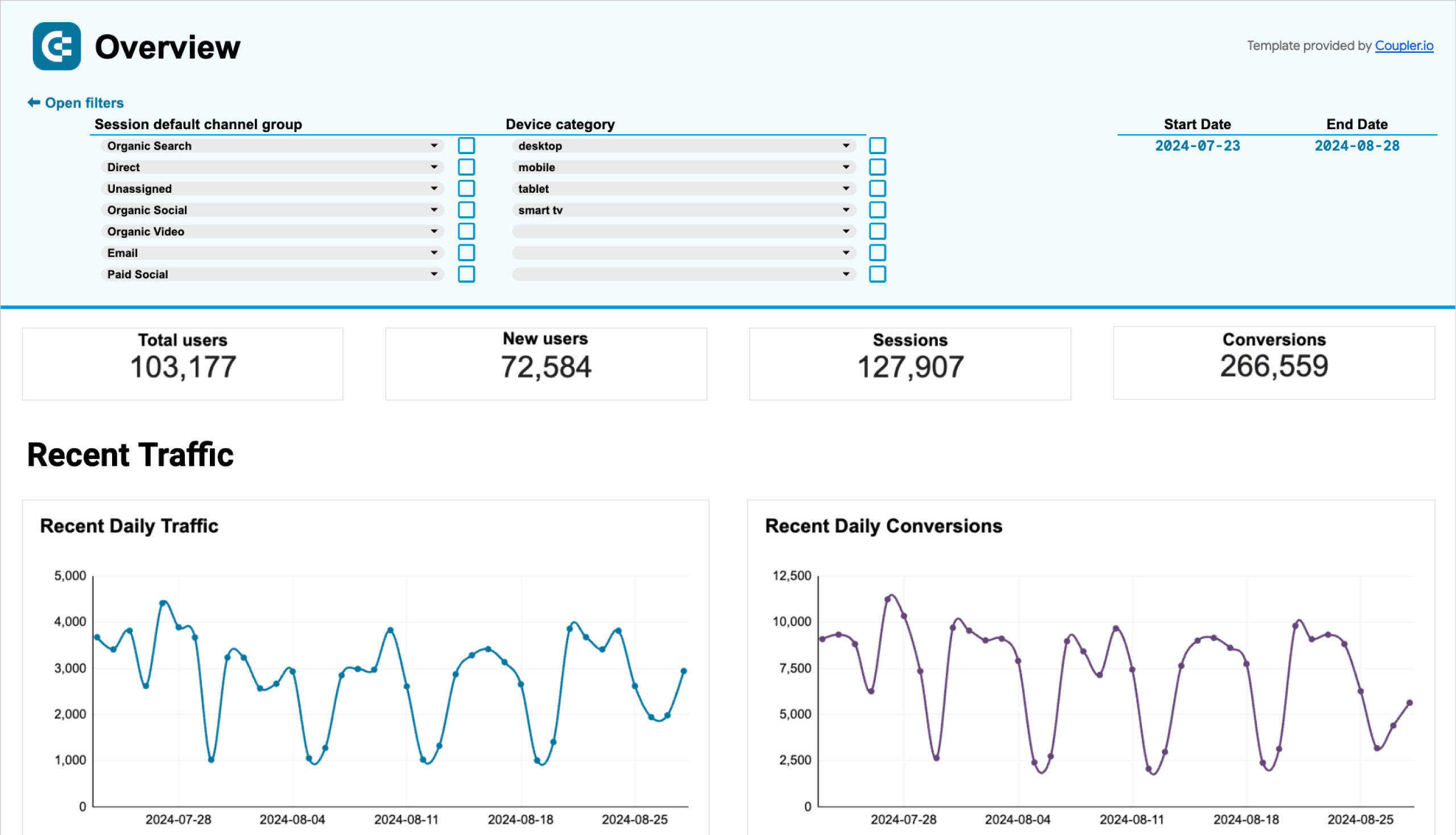
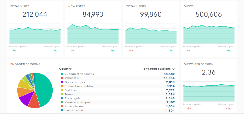
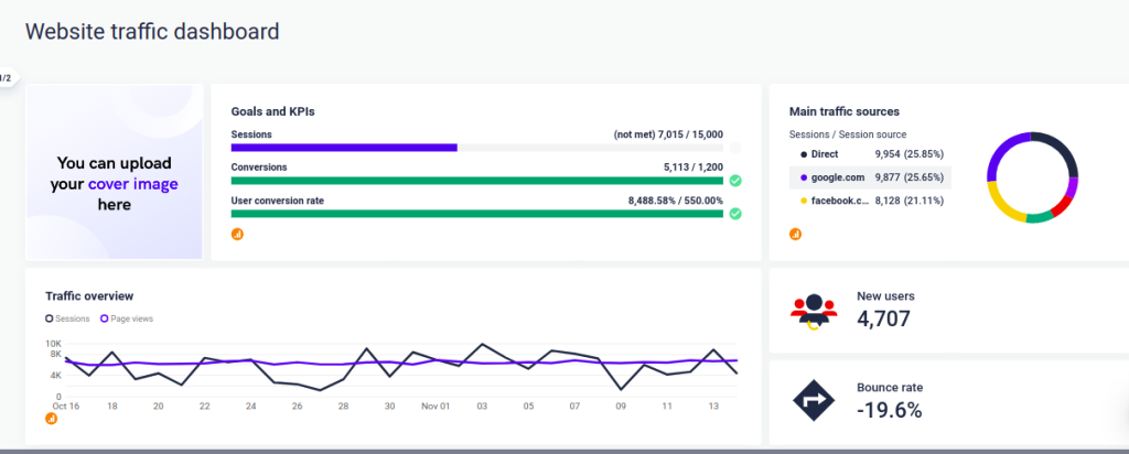
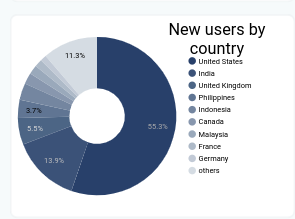
This is a web analytics dashboard designed by Coupler.io, a reporting automation platform. It is a template, which means that you can use it right away. The dashboard is based on GA4 and shows the most important metrics by default: total and new users, number of sessions, average session duration, pages per session, conversion rate, and other key conversion metrics.
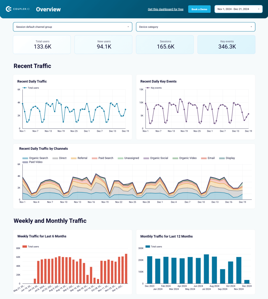
This CEO dashboard template is available for Google Sheets, Looker Studio, Power BI, and Tableau. Each version is equipped with a built-in GA4 connector by Coupler.io. So, you can easily integrate it with your GA4 account and start using it for your reporting and analytics.
All of the metrics on the dashboard can be filtered by country, source of traffic, medium, and landing page. You can quickly view conversions and the number of page views as a graph and multiple disambiguation of new users as pie charts.
The web analytics dashboard by Coupler.io is free to use for anyone. Choose the desired version of the template and try it right away!
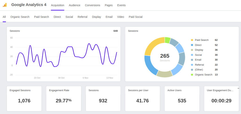
Web analytics dashboard in Looker Studio
Use the insights based on the data from GA4 to monitor your website traffic and discover which pages resonate most with your audience.


Web analytics dashboard in Tableau
Monitor the performance of your traffic, analyze the conversion funnel, and derive other insights from Google Analytics 4.

Web analytics dashboard in Power BI
Discover insights into your website’s traffic acquisition, audience, and conversions with Google Analytics 4 data seamlessly connected to our Power BI dashboard template.

Web analytics dashboard in Google Sheets
Gain valuable insights into your website’s traffic sources, user interactions, and conversion metrics based on data from GA4.

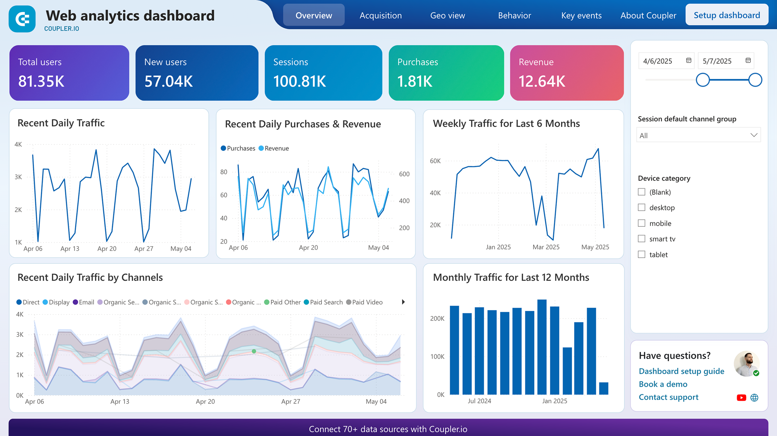
2. Google Analytics report for multiple properties by Coupler.io
Another dashboard template for website analytics from Coupler.io will make happy marketers and webmasters who manage multiple GA4 properties. The dashboard collects analytics from all your properties, so you can monitor how your traffic performs in one place. It’s very convenient to use one report instead of many, isn’t it?
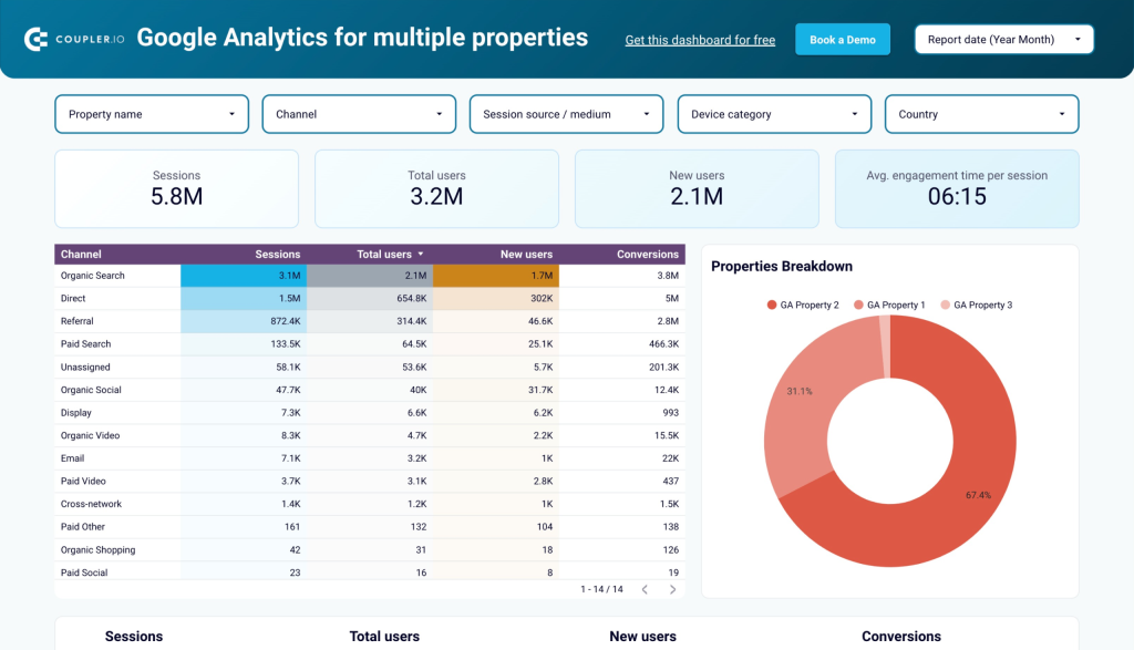
You get an overview of sessions, new users, conversions, and other essential metrics that you can filter by property. The template is designed in Looker Studio and equipped with the GA4 connector by Coupler.io. So, you only need to connect your account and select the needed properties to get started.
All dashboard templates by Coupler.io are free to use. So, try it out right away!
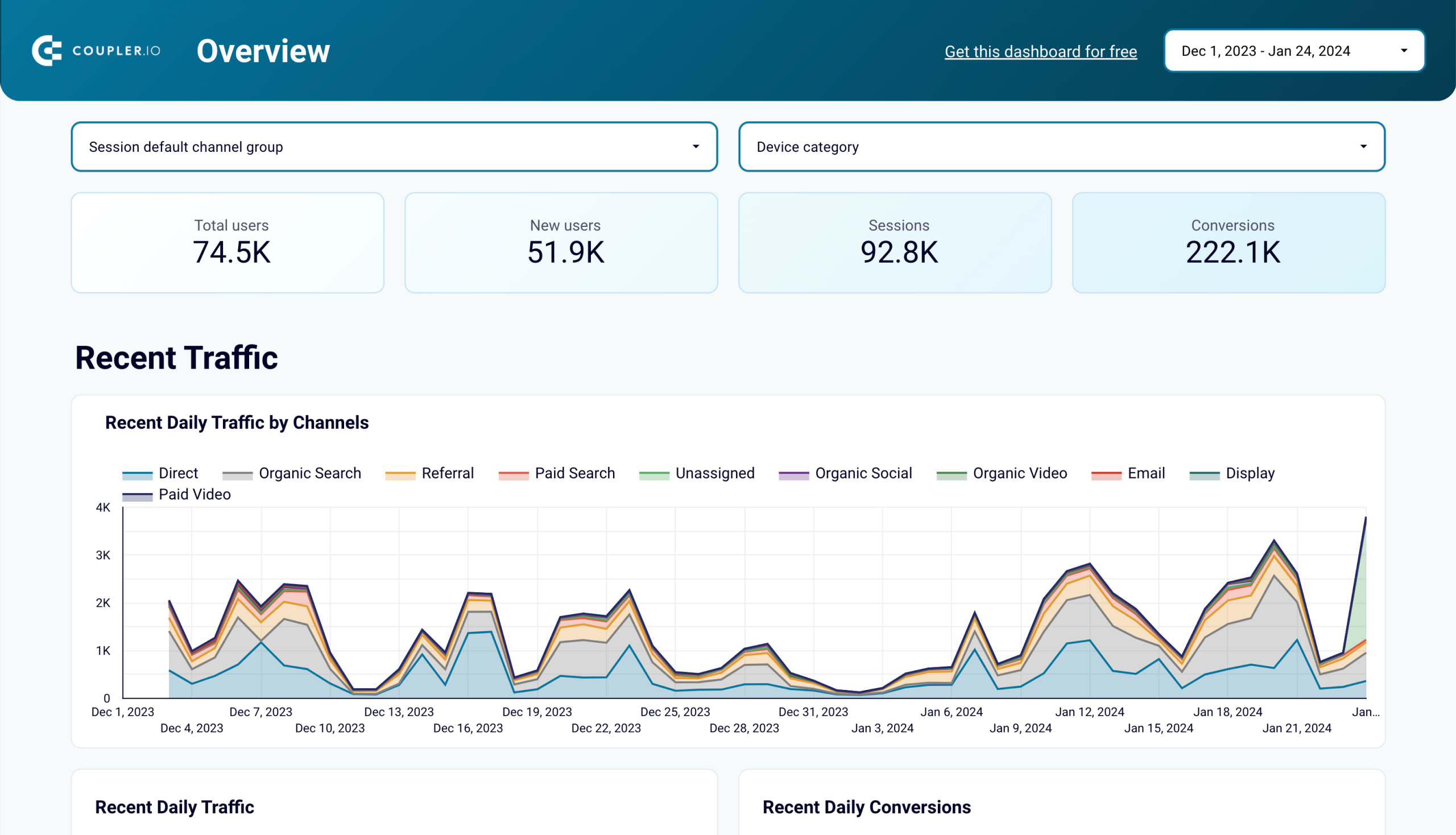
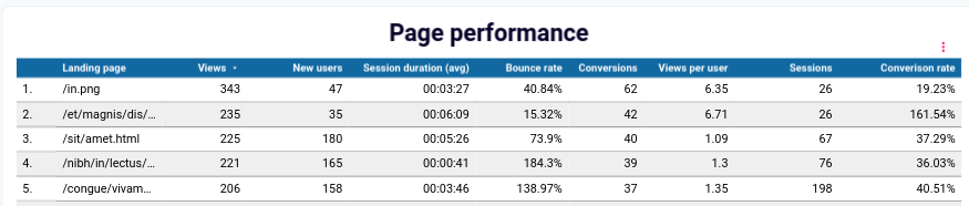
3. Landing page performance dashboard (Search Console + GA4)
This dashboard lets you monitor the performance of landing pages for the last 30 days. The performance evaluation is based on the data collected from two sources: Google Search Console and Google Analytics 4. As a result, you get two sets of key metrics:
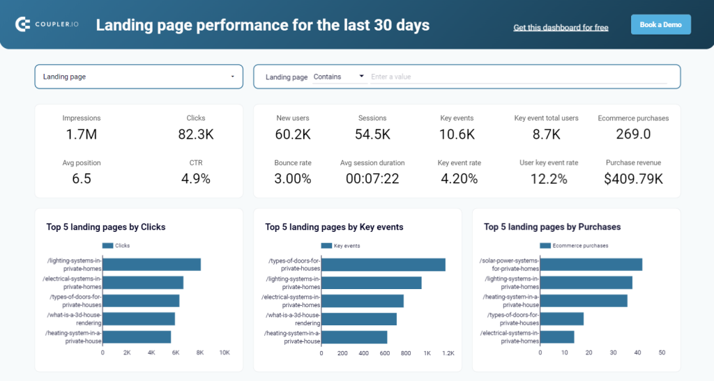
- GSC metrics include information about impressions and clicks your pages have generated, and the average position and CTR.
- GA4 metrics include information about new users, sessions, key events, ecommerce purchases, and more.
The overview of the performance metrics is available at the top of the dashboard. At the bottom, there is also a breakdown table to display how each page performs.
To dashboard template is designed in Looker Studio and equipped with the Coupler.io connector. This means you only need to connect your Google account for GSC and GA4 and you’ll get a copy of the dashboard showing your data.
In addition to web analytics, Coupler.io experts design other templates for marketing dashboards, sales reports, and so on.
Check out what a solid influencer dashboard may look like.
If you want to use Coupler.io for data connections, the pricing starts at $24 per month, which grants you more than enough credits to run a website analytics dashboard. You can start with a 7-day free trial on the Team plan and then switch to other subscriptions or even downgrade to the Free plan.
4. Cyfe Google Analytics dashboard
Cyfe is a company that specializes in dashboards, and it has integrations with dozens of data sources. It has several dashboard templates, and the one that is most useful for web marketing analytics is the Google Analytics template.
The way Cyfe’s templates work is they have many widgets — small windows that can display any metric you can import from Google Analytics or Google Search Console. You can also add any metric from another app that Cyfe supports as a widget. When you’re adding a metric, you can filter it to add just the information you need and nothing else. Cyfe supports ending read-only links that work without logging in.
A small problem with this dashboard is that you can’t arrange it vertically and end up scrolling horizontally. A larger one is that it takes a lot of steps to combine multiple metrics in a single widget.
Pricing starts at $19 per month for two dashboards running simultaneously. The highest pricing point is $89 per month for 20 dashboards.
5. Dashthis web analytics dashboard
Dashthis is also a company that specializes in creating dashboards. The dashboard it provides can be integrated with over 30 platforms, including the ones you need the most — Google Analytics data, GA4, and Google Search Console. It only integrates natively with one SEO tool, so you might not find what you need in the list.
As in many other dashboards, you can upload any data you need with CSV, but it’s obviously less convenient that way.
Dashthis dashboard also works by providing widgets to fill with information. However, the level of customization of these widgets is better than many competitors can offer.
You can share Dashthis dashboards by sending custom email marketing campaigns and add your own branding to the dashboard for your clients if you run an agency.
Pricing starts at $45 per month for three dashboards, with the highest subscription tier being $419 per month for 50 dashboards.
6. Geckoboard web analytics dashboard
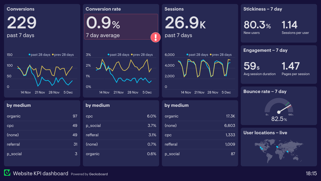
Geckoboard is a quite stylish-looking drag-and-drop dashboard builder. You can integrate your built dashboard with more than eighty integrations that include CRMs, payment systems, and apps necessary for a web marketing analytics dashboard. Geckoboard doesn’t include direct integrations with SEO tools, so you’ll have to manage it through third-party software if you absolutely need it.
The Google Analytics dashboard template the company provides does a pretty good job of outlining the most prominent metrics you need to track. If needed, you can resize the widgets or change the information displayed in them.
The pricing for Geckoboard starts at $49 per month for a single dashboard, which is quite cheap. If you want to host up to five dashboards with the basic plan, you’ll need to pay $149 per month. The most expensive plan sets you back $699 monthly for 30 dashboards.
7. AgencyAnalytics web analytics dashboard
AgencyAnalytincs, just like you might have guessed from the name, is tailored toward agencies and freelancers who need to provide reporting to clients. Like many other tools, it has a drag-and-drop dashboard builder and can be integrated with around 75 data sources, including the ones you might need for the web analytics dashboard.
You can also integrate the dashboard with a lot of SEO tools, so if that’s a part of your reporting, you won’t have to manage additional data exports. Reporting can be automated and automatically sent to the main recipients via email or Slack.
What differentiates this dashboard is that it has easy access to more advanced metrics by letting you set up calculations based on data from different data sources. It also lets you add annotations to dashboards, making the creative collaboration process easier.
Pricing starts at 12 per client per campaign with the catch that you buy a minimum of five campaigns, totaling $60 per month. For more advanced features, the price rises to $18 per client, with a minimum spend of $180 per month.
8. Datapine web analytics dashboard
Datapine is a great service for data visualization, and it has dozens of different templates as well as tons of opportunities for customization. Just for web analytics, Datapine has four adjacent templates: the content marketing analysis dashboard, GA page rank tracking, and GA audience dashboards.
But it’s more suited to connecting proprietary databases to the dashboard, not integrating online tools seamlessly. Datapine does have some standard API connectors, but they’re limited to a handful of CRMs, social media connectors like Facebook Ads, and Google Ads. To connect data from all the apps you need for a web analytics dashboard, you might have to put in a bit of effort.
Pricing ranges from $249 to $1099 per month.
9. Whatagraph web analytics dashboard
Whatagraph focuses on data analytics automation and offers both automated data import and automated sending of web analytic reports. It has dozens of native integrations that include every data source you might need for a basic web analytics dashboard and has the option to connect most other apps via BigQuery integration.
The most useful dashboard for web analytics would be the Google Analytics report, Google Analytics dashboard, or Google Search Console dashboard. The dashboard loads some key performance indicators like website traffic, user engagement rate, goal completions, and other prominent Google Analytics metrics by default.
You can also add widgets with metrics from any of Whatagraph’s integrations and change the way they’re displayed.
The pricing is a bit steep, though. It starts at $178 per month with 25 data sources connected. If you need more, the price of the basic package rises to $289 per month. The price of a single data transfer to BigQuery is $89.
10. Owox web analytics dashboard
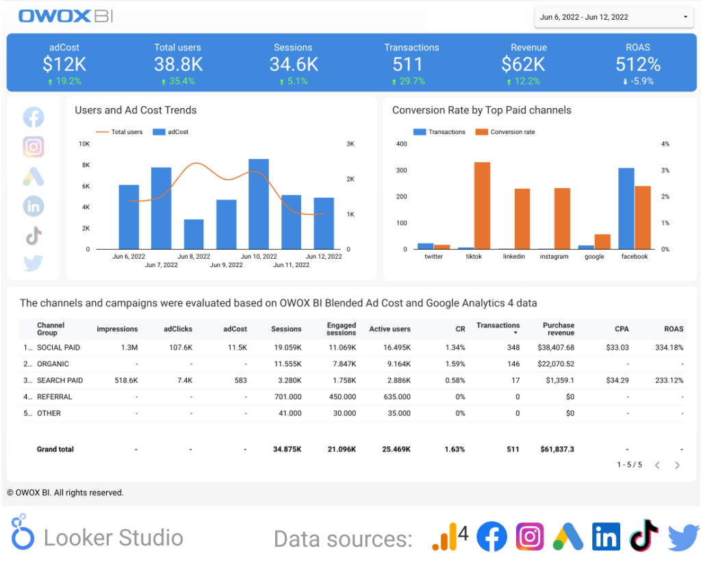
This BI solution has dozens of templates, but all of them are Looker Studio templates. This means you won’t need to log in to yet another tool and get used to it, and you can get a template for free if you provide your work email.
Since Looker Studio is a barebones solution, the potential to customize it and share it is endless. You can also easily switch between data automation solutions while still keeping the same Looker Studio document.
However, you might have to do some optimization before using the OWOX GA4 dashboard. In its current form, the dashboard combines Google Analytics with paid channels, which might not be ideal depending on your goals.
The dashboard itself is free to save upon giving your work email. If you want to use OWOX with it, pricing starts at $99 per month (which only grants you 12 data connections). Its most expensive Enterprise plan costs $2000 per month.
11. Ortto web analytics dashboard
Ortto is a company that focuses on analytics solutions and offers quite a few dashboard templates. The web analytics dashboard the company provides covers all the important metrics from Google Analytics and can be customized if needed.
You can also automate emails or Slack notifications with Ortto’s dashboard.
Pricing starts at $599 per month, which is reasonable for the number of tools Ortto provides but definitely not the sum you’d want to pay if you just need a simple dashboard.
12. Softr web analytics dashboard
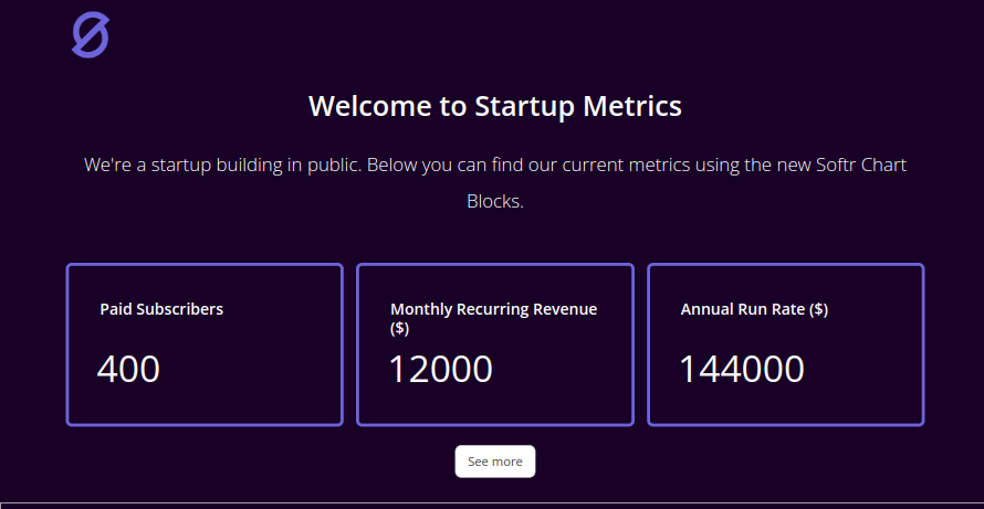
Softr doesn’t just provide a dashboard template. This is a no-code app-building software that you can use for anything from creating websites to running customer portals. It can also be used to create all sorts of dashboards.
You can connect thousands of external apps to Softr, so building an analytics dashboard won’t be a problem in terms of data availability. It’s also very customizable, with multiple design choices available, even though it requires a bit of work to build a dashboard on Softr.
If it’s only the dashboards you need, you might be okay with the first subscription tier that comes at $59 per month. This lets you have ten internal users of the dashboard you make and up to a thousand external users.
What is a web analytics dashboard?
A web analytics dashboard is a visual reporting tool that brings all the metrics to track and analyze traffic performance in one place. It’s a visual representation of thousands of data points from different sources in an easy-to-understand visual format.
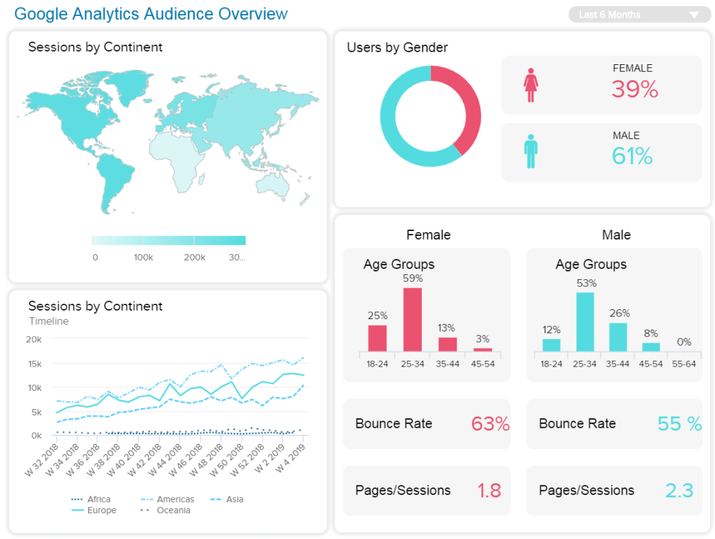
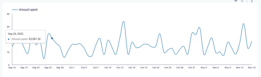
Web analytics dashboards typically either show metrics as simply as a number (scorecard) or illustrate them with graphs or charts. For instance, a pie chart breaks down metrics into proportions or compare different metrics. It can be used to compare traffic from different countries.
Graphs are used to compare the same metric over time. It’s a simple visual way to see a change in a key metric and spot a trend.
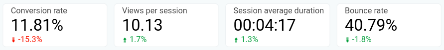
You can communicate the same information for less important metrics by adding a colored arrow or a month-over-month change in percentages to metrics you show with a single number.
Since this kind of marketing dashboard focuses on search engine performance, the main source of the data is Google Analytics. It contains the most important metrics that you need to understand how your business website performs. You might also use data from SEO tools like Google Search Console or CRM apps to have a more detailed picture.
Most web analytics dashboards are designed in Google Sheets, Looker Studio, Power BI, and other BI tools. Or they are available as a built-in feature in the admin panel of the SaaS analytics tool you use.
Importance of web analytics dashboards for business
Dashboards are handy tools for any business, and there are three main reasons for that.
Web analytics dashboards let you gather multiple data sources in one place. For instance, unlike a social media dashboard, it may contain data from Google Analytics and an SEO tool. Checking the most important performance metrics of the two platforms together in a single dashboard is always more practical.
Dashboards also give you a customizable way to have a quick look at the most important metrics for your business. You can configure the dashboard once and save yourself the time of browsing Google Analytics to find the right data.
But mainly, web analytics dashboards are a great way to communicate the key web analytics metrics to stakeholders who either aren’t proficient in the tools or don’t have access to them. Whether these are team members or clients, you can provide them with an easily accessible way to stay in touch with the website’s performance.
What a great web analytics dashboard should look like
When you’re choosing what dashboard to use and how to configure it, follow these four simple principles.
All the right metrics
First off, it has to contain all the metrics that are valuable for your marketing efforts. This mostly includes work on your end to figure out what you need to track to measure success.
But the dashboard itself also has to accommodate for including all of these metrics. It has to have the option to connect your data sources and export data automatically.
Intuitive understanding
The reason why dashboards are great tools is that they condense thousands of data points into an easy-to-understand form. This is why intuitive understanding is a necessity when picking a dashboard.
It needs to have good-looking data visualization templates with clearly visible legends as well as use standard and consistent visual design elements.
Partly, this factor depends on your work too. You need to keep your dashboard simple and not overcrowd it with charts and numbers that are easy to understand.
Customizable
The two factors above heavily depend on how deeply you can customize your dashboard. Having a large selection of dashboard templates is great, especially if you’re a beginner, but at the end of the day, the more customization options you get, the better.
If you can’t change chart colors to match your or your client’s branding or you can’t add or delete small additions like the month-over-month change indicators, you’re going to struggle with this dashboard more than you have to.
The last factor is a seemingly small one, but it might cause a lot of inconvenience if not present. Dashboards are meant to be shared with a lot of stakeholders. And if they’re forced to log into a tool once a month to view the dashboard, it’s going to create unnecessary delays and frustrations.
So if you’re not using Looker Studio for your dashboard, it’s best if the tool doesn’t require you to log in to view shared links.
How to create a web analytics dashboard
Now that you have a comprehensive understanding of what are the best web analytics dashboards, let’s look at the steps you need to take to create one. This short guide will be handy for any dashboard or tool.
Consider who the stakeholders are
The first stage of building your dashboard is understanding who the end recipients of it are. Depending on who needs this dashboard and why, you might want to configure the dashboard accordingly.
For instance, if the intended users are mostly data scientists, you can add more metrics and show each metric in more detail. If the users are clients who need basic reporting, you can focus on showing the basic metrics with a good-looking design.
For many dashboards, though, it’s best if you can at least somewhat combine the two. The simplest way to do that is to put the most essential metrics on top of the dashboard, add more detailed data lower, and allow for applying filters to the data.
Decide on what metrics you need to track
Next, you want to look at the metrics you need to track for the dashboard. For an average web analytics dashboard, it’s these five metrics.
- Number of sessions
- Average session duration
- Pages per session
- Bounce rate
- Conversion rate
You should build your dashboard based on your own goals and KPIs, so add whatever metrics are important to your business.
Once you understand what metrics are a priority, create a list of data sources you’re going to use. You’ll definitely need G4 on that list, as it’s the primary data source for web analytics. You might also use Google Search Console or SEO tools for supporting metrics.
Connect data sources
With the list of data sources and metrics you need, use your select tool to connect the data sources to the dashboard. For most tools, this is done with a no-code connector that requires you to provide access to your account in the data source and point the tool to the right metrics.
With Looker Studio, you can connect a data source like GA4 natively, but it might be a bit slow with calculations and integrating multiple data sources. You can connect GA4 to Looker Studio, Power BI, and other BI tools using Coupler.io simply as that. Just select the required destination app in the form below and click Proceed. Sign up for free and follow the instructions to set up the connection.
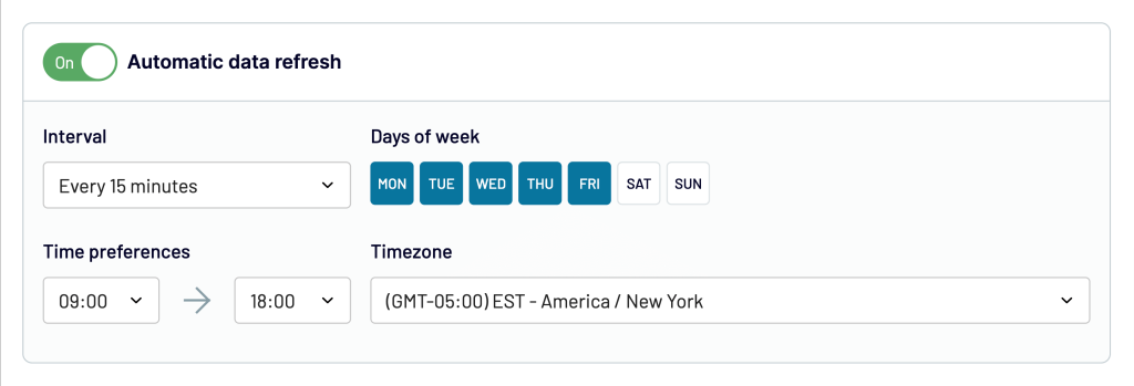
Schedule data export
After connecting all of the data sources to the right tool, configure the timing of the data export. Set a timeframe for your tool to export the data and refresh the dashboard.
If you’re creating a dashboard for reporting to clients, refreshing it monthly might be enough. But if you need to monitor it constantly, it’s best to set up daily data exports.
The Coupler.io lets you schedule data refresh as frequently as every 15 minutes to make your dashboard almost live.
Test the dashboard
The last step you have to take is to test your dashboard. Make sure the data is exported as intended, all the necessary calculations are made correctly, and the dashboard can be shared with stakeholders.
With that, your web analytics dashboard is complete.
What metrics should you include in a web analytics dashboard?
There are hundreds of web analytics metrics, and no dashboard can realistically display all of them. It’s best to limit yourself to showing no more than ten or fifteen metrics in a single dashboard; otherwise, it might be too visually crowded.
To get more information in a dashboard, you can present sessions by traffic source like referral traffic, by region, or by device. You might also add a table that provides more details for specific metrics.
It’s best to add it after the more easily understandable dashboard elements.
Other metrics you might want to include in the dashboard are:
- Number of users
- The ratio of returning to new website visitors
- Number of goal completions
- Goal value
- Number of transactions
- Revenue
- Total number of leads
If your web analytics dashboard should be more focused on organic search and SEO, you can include these metrics from Google Search Console or SEO tools:
- Number of impressions
- Number of clicks
- Average search position
- Average CTR
- Top-performing web pages
- Top keywords
Ultimately, the choice of metrics in your dashboard is up to you and should correspond to your business goals and KPIs.
Is a web analytics dashboard enough for your needs?
While a dashboard is a comparatively simple tool, most businesses could use one or a few of them. Now that you know what the best web analytics dashboards are, you can pick one up and use it to improve your business.
But is a dashboard enough for your analytics needs? As Steve MacFeely, Director of Data and Analytics for WHO puts it, dashboards aren’t the answer to everything. They’re just tools, and ones more suited towards monitoring the performance of key metrics, and not more.
So when you’re choosing the arsenal of digital marketing tools to suit your business, don’t stop at the web analytics dashboard. Explore other dashboards that can improve your understanding of business operations and dig deeper with BI tools.
Automate reporting with Coupler.io
Get started for free


