Whatagraph is a data reporting tool targeted at marketing agencies and in-house marketing teams. It lets you connect data from multiple marketing platforms and turn it into live, interactive, and white-label reports. Alternatively, you can send the data to a data warehouse.
Whatagraph reviews are generally positive. At the same time, there are repeated complaints regarding the lack of a free trial option, non-transparent & unaffordable pricing, occasional stability issues, and missing integrations. If you believe these problems might be difficult for you to put up with, we’ve prepared a selection of the top 5 Whatagraph alternatives. Read on to learn more about the pros and cons of each solution, available integrations, pricing, and more.
What’s the best Whatagraph alternative: A quick intro and reference table
We’ve selected 5 solutions that are likely to meet your data reporting needs, plus offer what you might be missing in Whatagraph. Here they are:
- Coupler.io — an affordable and reliable data reporting and visualization platform. It allows you to load data from marketing and business sources, organize it into reports, and import it to spreadsheets, BI tools, and data warehouses. You can also visualize data with 100+ premade dashboards in no time.
- Portermetrics — a marketing reporting platform with rich visualization options and 100+ ready-made dashboards to use either in Google Looker Studio or Google Sheets.
- Geckoboard — a data reporting platform that focuses on creating custom dashboards and sharing your data visualizations with team members, customers, and other stakeholders in many ways.
- Databox — a well-established data reporting platform offering many integrations and ready-made dashboards. You can use it to quickly build your own reports and share them with others.
- Funnel — a popular data reporting platform that supports many integrations. In addition, it offers rich transformation options and pre-made dashboard templates to make your work faster.
Have a quick look at the table to spot the most important facts and figures about each alternative to Whatagraph:
| Starting price | Free trial | Data sources | Data destinations | Ready-made dashboards | Smallest data sync frequency | User reviews | |
| Whatagraph | custom | ? | 50+ | 2 | 42 | n/a | G2: 4.5/5 Capterra: 4.4/5 |
| Coupler.io | $24 | ? | 60+ | 10+ | 100+ | 15 minutes | G2: 4.8/5 Capterra: 4.9/5 |
| Portermetrics | custom ($12.5 per source) | ? | 15+ | 9 | 100+ | 1 day | G2: 4.6/5 Capterra: 4.5/5 |
| Geckoboard | $60 | ? | 90+ | n/a | n/a | source -dependent | G2: 4.3/5 Capterra: 4.6/5 |
| Databox | $47 | ? | 120+ | n/a | 300+ | 1 hour (15-minute sync as a paid option) | G2: 4.4/5 Capterra: 4.7/5 |
| Funnel.io | $216 | ? (you can use the Free plan) | 590 (the highest plan) | 27 | undisclosed | 2 hours | G2: 4.5/5 Capterra: 4.7/5 |
Our choice of the 5 best Whatagraph alternatives in 2025
Coupler.io
Coupler.io is a data reporting & automation platform that transforms data from 60+ popular apps/services into insightful reports in just minutes. With its intuitive wizard, you can quickly combine and transform your data on the go. This eliminates error-prone and time-consuming manual copying, while providing a clean and meaningful dataset to work on. Next, you can use Coupler.io to load the dataset into a spreadsheet, business intelligence tool, or data warehouse and sync it in near-real-time to always enjoy fresh data during your analysis.
It also allows you to visualize the dataset with one of the 100+ free, ready-made dashboard templates. With a visually appealing dashboard, everyone will be able to spot key takeaways and trends much faster than from dozens of data tables. You’ll save a lot of time on data visualization too.

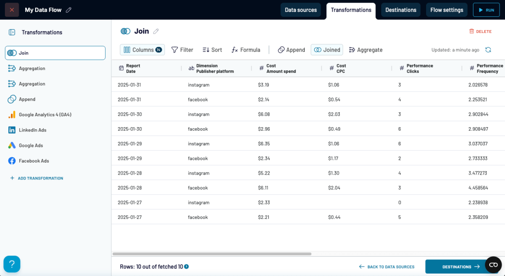
With Coupler.io, you get a rich set of data transformation features to clean up and reshape your raw data on-the-go. Before it actually reaches a destination or a dashboard, you can:
- Blend data from 60+ integrations into a single report to have a single source of truth and avoid going through multiple spreadsheets and apps/services, which only brings chaos and is time-consuming;
- Freely manage data columns by reordering, hiding, or renaming them to make your final report include only the data you want;
- Filter out data to skip irrelevant or incomplete data row items;
- Sort data in ascending/descending order, so that it displays the way that’s more convenient to you or, for example, your CEO;
- Use custom formulas to create new columns based on raw data calculations, so that the data on your final report is more unified;
- Aggregate raw data by combining dimensions and metrics to drill down your data.
With the transformations applied, the data you import to a BI tool (Looker Studio, Power BI, etc.), spreadsheet software (Google Sheets, Microsoft Excel), or data warehouse (BigQuery, PostgreSQL, etc.) is no longer raw but 100% meets your visualization and analytics needs.
Note: With such rich data optimization options, you can consider Coupler.io one of the best Klipfolio alternatives too.
Last but not least, Coupler.io is backed by approachable and highly-rated human support, an extensive knowledge base, as well as transparent and affordable pricing options.
| Pros | Cons |
| • Affordably priced from $24/mo • User-friendly & wizard-based UI, no coding required • Data transformations to clean up and adapt data to your very specific needs • Automated data refresh (every 15 minutes at maximum) • Ready-made dashboards to start visualizing data instantly • Google Sheets and Microsoft Excel add-ons to manage your dataflows directly from spreadsheets • Highly-rated human support team • Complementary analytic services by professional Coupler.io data analysts | • The majority of the dashboards are designed for external tools, including Google Sheets, Looker Studio, Power BI, and Tableau • Currently, only 11 destinations are supported • Only a near to real time data sync interval is available (every 15 minutes) |
Coupler.io pricing
You can trial the product inside-out by yourself, free of charge, for 7 days. The paid plans start at $24/month, but there’s also a free forever plan suited for the basic needs of reporting automation. You can opt to be billed monthly and annually, so there’s a nice degree of flexibility, too. What’s great about Coupler.io is that all integrations and pre-made dashboards are available to all users, regardless of the pricing plan!
See the key details of the plans available for Coupler.io in the table below:
| Plan | Starting price | Max. data connections | Max. users | Min. data refresh interval |
| Free | $0 | 1 | 1 | manual |
| Personal | $24 | 5 | 1 | daily |
| Professional | $99 | 25 | 2 | daily |
| Team | $199 | 100 | 5 | hourly |
| Business | $449 | 400 | unlimited | 15 minutes |
To get full pricing info, visit Coupler.io dedicated pricing page.
Coupler.io integrations
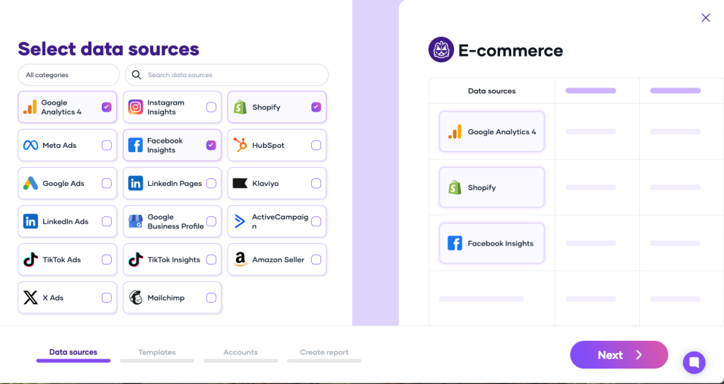
Coupler.io lets you freely blend 60+ source integrations with 10+ destination integrations. You can find popular marketing tools, spreadsheet software, web analytics tools, CRMs, data warehouses, and more.
Where you can take data from:
- PPC and marketing (Google Ads, LinkedIn Ads, etc.)
- Spreadsheets (Google Sheets, Microsoft Excel)
- Web analytics/SEO (Google Analytics, Google Search Console)
- E-commerce (WooCommerce, Shopify, etc.)
- Sales (Salesforce, Pipedrive, etc.)
- Accounting (Xero, QuickBooks)
- CRM (HubSpot, Klaviyo, etc.)
- Project management (Jira, Trello, etc.)
- Time tracking (Clockify, TimeTonic, etc.)
- Databases (BigQuery, PostgreSQL, etc.)
Where you can load data:
- BI tools (Looker Studio, Power BI, Tableau, Qlik)
- Spreadsheets (Google Sheets, Microsoft Excel)
- Data warehouses (BigQuery, Amazon Redshift, PostgreSQL)
- Task management (Monday.com)
- Other (JSON)
See the official and comprehensive listings for data sources and destinations supported by Coupler.io.
Portermetrics
Portermetrics, or simply Porter, is another Whatagraph alternative. It’s a no-code data reporting tool for teams and agencies. It lets you bring your most important digital marketing KPIs together to avoid manual copy-paste operations, speed up your team’s work, and support data-driven decisions. It’s straightforward to use, letting you perform basic operations on your data dashboard, such as filtering data, adding brand colors, adding custom charts, etc.

Due to the limited number of supported integrations and dashboard customization options, you can conclude that Porter won’t be particularly useful for more advanced scenarios. Besides that, the product can be a good fit for small businesses or freelancers, especially those looking for a rich choice of ready-made dashboards.
To finish off, we’d like to mention that Porter offers several support options, including chat, email, and Slack.
| Pros | Cons |
| • Customizable price — you pay for what you use (sources, blending) • Rich gallery of free and premium dashboard templates • Multiple ways to export/share a dashboard, such as PDF, link, or email | • Can be expensive, especially if you want to blend data sources • No clearly defined plans; monthly amount depends on sources and data blending • Less than 20 supported data sources • Only 3 direct data destinations • Can be too simple for more advanced needs • No transformation options to clean up and organize source data |
Portermetrics pricing
You can test Porter for free for 2 weeks. After that, you need to start paying, as no free plan is available. In fact, Portermetrics has no fixed price plans. The exact amount depends on the number of sources you connect and whether you want to blend data from these sources or not.
The minimum payment is $12.50/mo for a single non-blendable source. If you purchase more than 3 such sources, discounts apply. For example, you’ll pay $33.30 for 4 sources.
In the case of a blendable data source, the price is much higher and amounts to $41.70/mo. So, if you wish to blend data from many sources (e.g., Google Ads, Facebook Ads, Google Analytics, and Shopify), your costs can become quite considerable.
Portermetrics integrations
Compared to competitors, the number of supported sources and destinations is rather small. It equals 19 and 3 respectively. See the exact Portermetrics integrations below.
Where you can take data from:
- Facebook Ads
- TikTok Ads
- Twitter Ads
- LinkedIn Ads
- Facebook Insights
- Instagram Insights
- LinkedIn Pages
- Twitter Analytics
- Instagram Competitor Analysis [organic]
- Facebook Competitor Analysis [organic]
- HubSpot
- Klaviyo
- Mailchimp
- Active Campaign
- WooCommerce
- Shopify
- Amazon Seller Central
- Google Business Profile
- Google Analytics 4
Where you can load data (directly, without intermediaries):
- Looker Studio
- Google Sheets
- BigQuery
Geckoboard
Geckoboard is a data reporting platform focusing on easy and quick dashboard creation and sharing, which also makes it one of the nicest AgencyAnalytics alternatives. Once you connect your data source(s), you can build your report using interactive widgets by simply dragging and dropping them. In the meantime, you can use several options to fine-tune and filter your data. Finally, you can share the dashboard via link, invite your team to collaborate, display the dashboard on a TV in your conference room, and more.

While the app supports quite a lot of data sources (90+), you cannot use it to push data to any kind of destination. Consequently, it won’t fit your needs if you’re looking for a data backup solution or want to visualize your data with a third-party business intelligence tool like Looker Studio. On the upside, Geckoboard is a good choice if you want to always have the freshest data on your dashboards. That’s because the data refresh rate is limited by a source integration only—for details, see this list. Consequently, you’ll be able to sync some sources even in real-time or near-real-time.
| Pros | Cons |
| • Intuitive no-code & drag-and-drop dashboard builder • Near real-time or real-time data refreshes (source dependent) • Multiple dashboard sharing options (link, file export, TV screen) • Interesting additional features, for example: real-time collaboration, easily shareable dashboard screenshots, interactive view of changes on your dashboards, etc. | • You cannot move data out of Geckoboard, for example, to back it up or use a third-party BI solution for more advanced or refined visualization • No ready-made dashboard templates to use right away (you can only get inspired with examples) • No free forever version • Basic paid version limited to just 1 dashboard |
Geckoboard pricing
To start your Geckoboard journey, you can trial the app for free for 14 days. Since no ‘free forever’ option is offered, you need to switch to one of the paid plans starting from $60/mo. Choose your plan wisely, as the basic option has some serious limitations, such as only allowing only 1 dashboard or no white-labelling options.
See the key details of the plans available for Geckoboard in the table below:
| Plan | Starting price | Max. dashboards | Max. dashboard editors | Max. dashboard viewers | Available source integrations |
| Essential | $60 | 1 | 1 | 10 | All |
| Core | $175 | 20 | 1+ | 25+ | |
| Pro | $319 | 50 | 3+ | 50+ | |
| Enterprise | custom | custom | custom | custom |
Geckoboard integrations
Similar to Coupler.io, Geckoboard allows you to use all integrations across all plans, which is advantageous. For an overview of Geckoboard integrations, refer to the list below:
- PPC (Google Ads, YouTube Analytics, etc.)
- E-commerce (WooCommerce, Shopify, etc.)
- Sales (Salesforce, HubSpot, etc.)
- Customer Support (Zendesk Support, Freshdesk, etc.)
- Finance (QuickBooks, PayPal, etc.)
- Productivity (GitHub, monday.com, etc.)
- Databases (MySQL, PostgreSQL, etc.)
See the official and comprehensive source listing for Geckoboard here.
Databox
Databox tags itself as ‘an easy-to-use analytics platform for growing businesses’. The tool allows you to load data from over 120 supported sources. Next, you can transform it with functions, filters, grouping, etc. Finally, you can visualize the data with proprietary dashboards to gain actionable insights and support data-driven decisions. Unfortunately, you cannot easily extract data from Databox to import it to a BI tool for more advanced visualizations. For such a scenario, only raw-data-to-CSV-export and API-based methods are available.
Databox might not be the best choice if you need an excellent customer support experience. That’s because customers often mention poor support in their reviews. So, if post-sales experience is crucial for you, look for a Databox alternative.

In Databox, you can use one of the 300+ pre-made dashboards, or you can easily make your own by dragging and dropping desired widgets. However, users often mention that the tool has a steep learning curve for new users, as you need to get used to its UI.
What we like about Databox is the extra features. You can, for example, use goal widgets that visually show your company’s progress towards specified goals, or set up custom metrics by combining standard ones, dimensions, and filters. However, the proverbial fly in the ointment is that users report the custom metrics feature as occasionally unstable.
| Pros | Cons |
| • Large number of supported integrations (+120) • Huge number of pre-made and attractive report templates (+300) • Drag-and-drop editor to build your dashboards • Interesting extra features like forecasting or setting goals on dashboards • Free forever plan available | • Steep learning curve for new users • Visualization limited to what Databox can offer you — no way to generate more complex charts, histograms, etc. • Only internal dashboards; no way to send your data further, e.g., to Looker Studio for greater flexibility • Paid plans (except for the highest one) include only 3 sources by default, so you often need to pay for additional sources ($5.60/source/month) • White-labeling options for dashboards are an extra-paid option ($200/month) • Poor support that’s hard to reach |
Databox pricing
To become familiar with the platform, you can use a 14-day free trial. When the trial ends, you can switch to one of the paid plans starting from $47/month or decide on the free forever plan if your data reporting needs are rather basic.
See the key details of the plans available for Databox in the table below:
| Plan | Starting price | Data connections | Max. users | Min. data refresh interval | Available integrations |
| Free Forever | $0 | 3 (max) | 3 | daily | All |
| Starter | $47 | 3 (option to buy additional) | 5 | every 4 hours | |
| Professional | $159 | 3 (option to buy additional) | unlimited | hourly | |
| Growth | $319 | 3 (option to buy additional) | unlimited | hourly | |
| Premium | $799 | 100 (option to buy additional) | unlimited | hourly |
Databox integrations
Databox is another Whatagraph alternative that lets you use all integrations across all plans. Consult the listing below for an overview of Databox integrations:
- Paid ads (Google Ads, Reddit Ads, etc.)
- Web analytics and SEO (Google Analytics, Google Search Console, etc.)
- Social media ads (Facebook Ads, Snapchat Ads, etc.)
- Spreadsheets (Google Sheets, Microsoft Excel)
- E-commerce (WooCommerce, Shopify, etc.)
- Email marketing (Mailchimp, SendGrid, etc.)
- Customer Support (Zendesk Support, CallRail, etc.)
- Accounting (Quickbooks, Xero, etc.)
- Productivity (Jira, Teamwork, etc.)
- Databases (BigQuery, Microsoft Azure, etc.)
See the official and comprehensive source listing for Databox here.
Funnel
Funnel.io is a versatile and well-established data reporting platform. It allows you to gather data from up to 590 sources. Then you can transform it according to your needs and push to one of the available destination apps/services. Alternatively, you can use one of the pre-designed proprietary dashboards to effortlessly visualize your data and get instant actionable insights.
Regarding customer support, users rate it positively in most cases. You can initiate contact directly from the app, and if you’re on one of the two highest plans, your support request will be treated with priority.

In addition to the record-high number of integrations, Funnel.io lets you use proprietary pre-made dashboards to streamline data visualization within the app. Unfortunately, there are no dedicated dashboards for BI tools that Funnel supports (e.g., Looker Studio or Power BI).
While Funnel provides some interesting features, such as reusable data-source templates, user roles & permissions, or SLA agreement, most are available only in the highest Enterprise or the second-highest Business plans, which are quite costly.
| Pros | Cons |
| • The largest number of source integrations (590) • The largest number of destination integrations (27) • Flexible pricing model • Free forever plan for very basic reporting needs • Fast and helpful support | • No real trial to test all the features of the app • Some popular integrations like Salesforce, Google BigQuery import, or Jira require at least the Business plan (the second highest one) • No financial integrations like Xero or QuickBooks • No ready-made report templates for 3rd-party BI tools • While flexible, the prices can quickly go high when you want to customize your plan • Extra and interesting features are limited to the highest plans only |
Funnel pricing
There’s no real trial that allows you, for example, to test absolutely all the features of the app. Instead, you can start on the Free (forever) plan that is limited to 4 sources and 1 destination. If you want more sources/destinations, you’ll need to opt for a paid plan.
Funnel offers a unique pricing approach based on plans and so-called flexpoints. Plans determine which features you can use, including which source and destination integrations are available to you. Flexpoints, on the other hand, control the number of sources and destinations that you can use. Each plan comes with a preset number of flexpoints. So, when you use them up and want to add other sources/destinations, you need to buy extra flexpoints in increments of 100. While this gives you freedom of choice, you can quickly end up with a high bill for your customization. Here’s an example of how many flexpoints you need to buy extra things and a calculation:
- A source connector (50 flexpoints)
- A source account (e.g., your TikTok account) (5 flexpoints)
- A dashboard (150 flexpoints)
- A BI destination (e.g. Looker Studio) (150 flexpoints)
- A data warehouse destination (e.g., BigQuery) (300 flexpoints)
So, if you, for example, want to create a workflow from Shopify to BigQuery, you’ll need 355 flexpoints:
50 (source Shopify connector) + 5 (source Shopify account) + 300 (BigQuery data warehouse destination) = 355 (in total)
See the key details of the plans available for Funnel.io in the table below:
| Plan | Starting price | Flexpoints included | Data sources | Dashboard destinations | Max. users | Min. data refresh interval |
| Free | $0 | 400 | 121 | 1 | 5 | daily |
| Starter | $245 | 500 | 121 | 3 | 5 | daily |
| Business | $767 | 500 | 579 | 6 | unlimited | every 2 hours |
| Enterprise | custom | custom | 590 | 6 | unlimited | every 2 hours |
Funnel integrations
Funnel.io offers the largest numbers of source and destination integrations. Have a look at the lists below for an overview of them.
Where you can take data from
- PPC (Google Ads, Microsoft Advertising, etc.)
- Social media ads (Facebook Ads, X Ads, etc.)
- E-commerce (Shopify, Magento 2, etc.)
- Search (Google Trends, SEMrush, etc.)
- CRM (HubSpot, Zoho CRM, etc.)
- Remarketing (DV360, Criteo, etc.)
- Tracking (GA4, Yandex Metrica, etc.)
- Email (Mailchimp, Marketo, etc.)
Where you can load data
- BI tools (Looker Studio, Power BI, etc.)
- Spreadsheets (Google Sheets, Microsoft Excel)
- Paid Ads (LinkedIn Ads, Facebook Ads)
- Web analytics (Google Analytics upload, Adobe Analytics upload)
- Data warehouses (BigQuery, Snowflake, etc.)
- Task management (Monday.com)
See the official and comprehensive listings for data sources and destinations supported by Funnel.io.
Why would you need an alternative to Whatagraph?
Whatagraph might have several interesting selling points, such as a user-friendly interface with drag-and-drop support, multiple ways to share reports, and decent customer service. However, it’s also true that there are drawbacks that might make your user experience quite painful:
- No free trial — to try the app, you need to provide your business details (email and phone) using the form. Only then will the Whatagraph sales team call you to learn about your business case and show you around the product. Such an approach might be problematic for those who want to test the app by themselves, at their own pace.
- Non-transparent and high pricing — as highlighted above, there’s no explicit info on pricing from Whatagraph, so you have to reach out to the sales team. Based on quite fresh historical data, we suspect that Whatagraph may not be an affordable solution.
- Narrow specialization — it’s true that the platform focuses on marketing data, particularly PPC apps/services. While you can find a handful of sources that offer sales insights (e.g., Shopify), you won’t find, for example, financial or accounting integrations.
- Stability issues — when asked about downsides, in their reviews, users often mention glitches happening from time to time. These include sudden data reloads, data not reflecting the source, or widgets breaking down when two users edit simultaneously. So, if you’re looking for a solid rock piece of software, you might be disappointed.
- Missing X Ads — some may be surprised that a marketing analytics platform like Whatagraph doesn’t support former Twitter paid ads integration, at least, at the moment.
- Few destinations — if you’re looking for a data analytics tool that not only exports data from a range of sources but also imports it into multiple destinations, you might be disappointed. Currently, Whatagraph only lets you import data to BigQuery (for storage) and Looker Studio (for visualization). That’s because the platform focuses more heavily on data visualization dashboards.
Why is Whatagraph pricing a big deal?
Currently, Whatagraph keeps its pricing undisclosed. To get tailored pricing, you need to contact Whatagraph representatives for a quote, providing your business details.
When visiting the Whatagraph pricing page, you can’t find any clues as to what amount to expect. The only hint is the historical data from the pricing page that shows $223 per month as the starting price.
Which Whatagraph alternative should you decide on?
Now that you know the 5 top Whatagraph alternatives and the main issues to expect with Whatagraph, you can make a fully informed choice. For your convenience, we’ve prepared a summary with recommendations:
- If you want to test a product inside-out before purchasing it, look for those alternatives to Whatagraph that offer a free trial: Coupler.io, Portermetrics, Geckoboard, or Databox.
- To avoid being overcharged and to have a clear picture of pricing, opt for Coupler.io. Geckoboard also has straightforward pricing; however, it is a more expensive and less versatile analytics tool.
- Speaking of versatility, Coupler.io and Funnel.io are the best choices, since they let you bring your data to both dashboards (for visualization) and destinations (e.g., for backup). However, keep in mind that Funnel.io is missing popular financial/accounting integrations, so it might not fit your data reporting scenario.
- Most of the tools offer good stability. However, if you’re looking for perfect reliability, you should avoid Databox whose more advanced features tend to cause occasional but frustrating problems.
- In terms of popular integrations, none of the tools should disappoint you. However, take your time to carefully analyze sources supported by Portermetrics and Funnel.io. The former offers a limited number of sources, while the latter restricts the availability of some common integrations to higher (and more costly) plans.
- If you were missing multiple data destinations support in Whatagraph, consider tools that work with at least ten destinations, like Coupler.io and Funnel.io. The latter is the record holder regarding the number of supported source and destination integrations, which is a plus.
To sum up, if you consider what’s missing from Whatagraph, Coupler.io seems to be the tool that fills in the most gaps. This Whatagraph alternative also comes with a host of other key advantages, such as:
- Unlimited access to integrations (both source and destination) and dashboard templates, regardless of your plan.
- Robust data blending and transformation options allow you to freely join data sources and make the final dataset look exactly the way you want.
- Rich library of ready-made dashboard templates for Coupler.io and the most popular business intelligence destinations to considerably speed up your reporting and data-driven decisions.
- Data sync scheduler to always keep your data up-to-date.
- Help of data analysts and a highly-rated support team, with a 9.7 out of 10 rating on G2.com
If you’re interested in Coupler.io, click the button below to trial it for free for 7 days and see if it meets your needs.
Automate reporting with Coupler.io
Get started for free