Xero offers many built-in reports to manage finances, sales, taxes, payroll, etc. You can share these by exporting them to spreadsheets (Google Sheets or Excel) or as PDFs. However, these reports are preset, i.e., you cannot customize them. If you want more than the native Xero reporting can offer, opt for custom Xero report templates. These templates combine information from different native reports and present your financial data with interactive and visual elements.
Top 7 Xero report templates for accounting
Explore the accounting report templates for Xero that you can easily use, customize, and reuse. All you need to do is fill the report with your Xero data to get useful insights without any additional effort.
1. Financial dashboard for Xero by Coupler.io
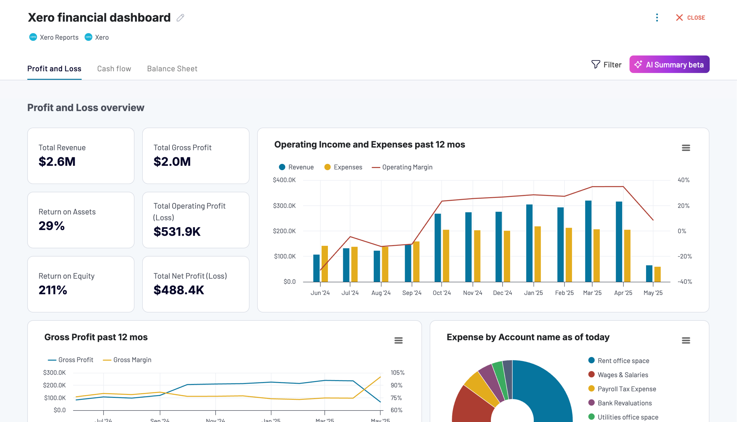
The Xero financial dashboard gives you a complete snapshot of your business’s financial health in one place. It simplifies financial tracking by consolidating revenue, expenses, cash flow, and balance sheet data into easy-to-read visual reports. Whether you’re a business owner or an accountant, this dashboard helps you monitor key financial metrics in real-time and ensures better decision-making.
Key insights
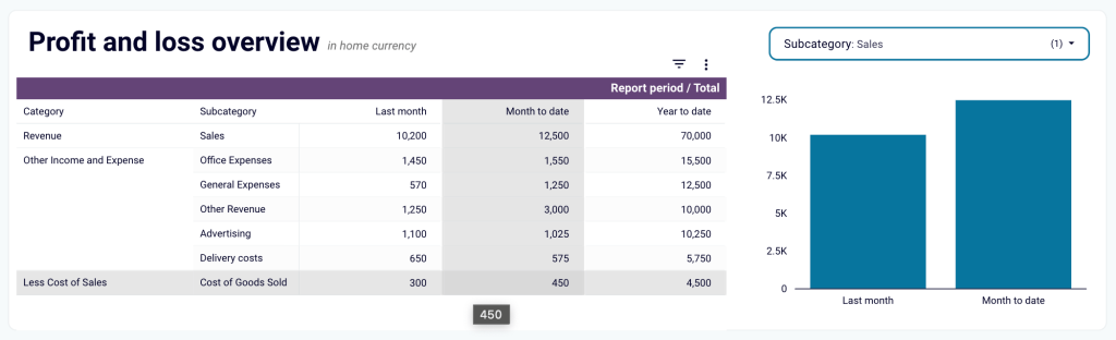
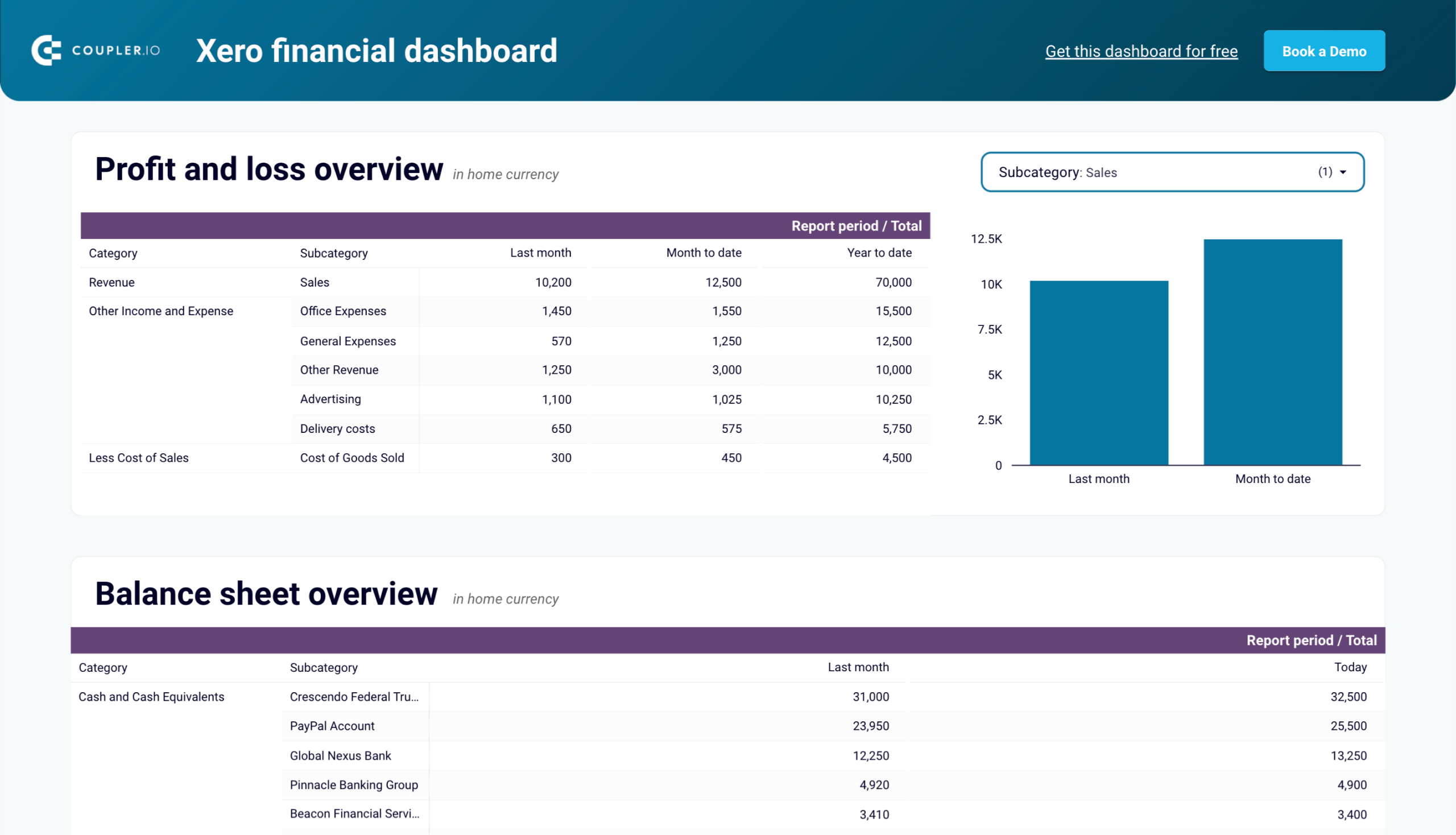
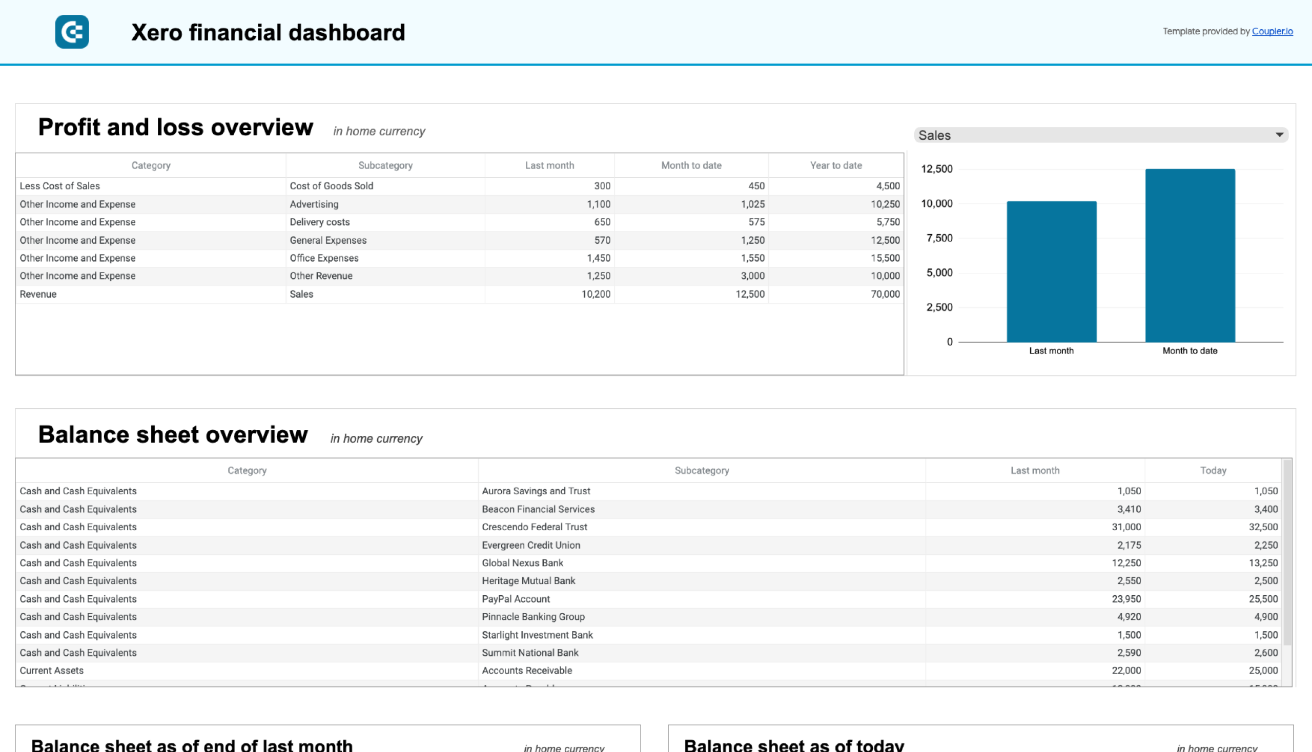
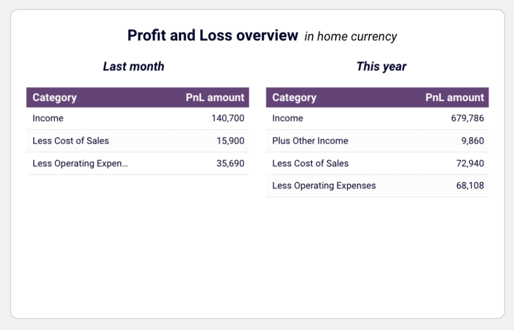
Profit and loss overview
The profit and loss section summarizes revenue, expenses, and net income for the last month, month to date, and year to date. It helps you understand how your income compares to expenses and spot areas where costs can be optimized. The interactive chart lets you filter data by subcategory, making it easier to analyze specific revenue streams or expense categories.
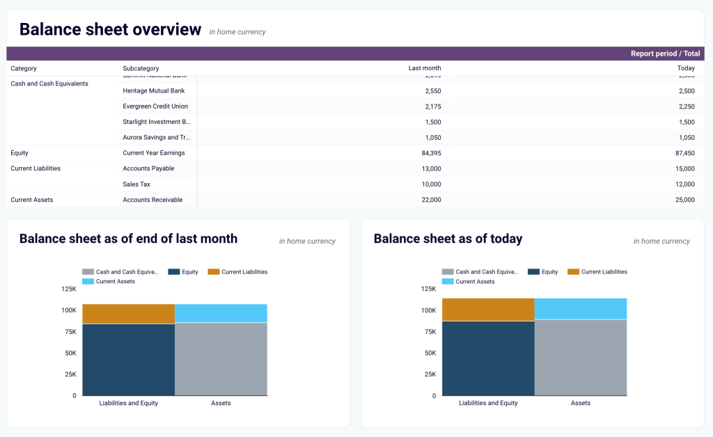
Balance sheet insights
This section provides a breakdown of your assets, liabilities, and equity to help you assess your company’s financial position. Two visualizations of this balance sheet dashboard compare figures from last month to today, allowing you to track changes in financial health over time and identify potential risks.
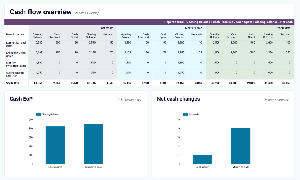
Cash flow analysis
Managing cash flow is critical for any business, and this cash flow dashboard makes it simple. It highlights net cash inflows and outflows, showing trends in liquidity and financial stability. The charts display your cash position at the end of each period and track net cash changes, helping you maintain a healthy cash reserve and avoid shortfalls.
Real-time financial tracking
Instead of manually pulling reports from Xero, this dashboard updates automatically, giving you an up-to-date view of your financials at any time. With interactive elements and scheduled refreshes, you always have the latest data available to support financial planning and strategy.
How to use the Xero financial dashboard template
The dashboard connects directly to your Xero account through the Coupler.io connector. You can use the dashboard directly in the tool. This way, you also get access to the AI insights feature that helps you quickly make sense of your data. Or you can opt for the Looker Studio or Google Sheets version of the template. To start using it, open the Readme tab from the dashboard’s left panel and follow the instructions to link your account. Once connected, your financial data will sync automatically.


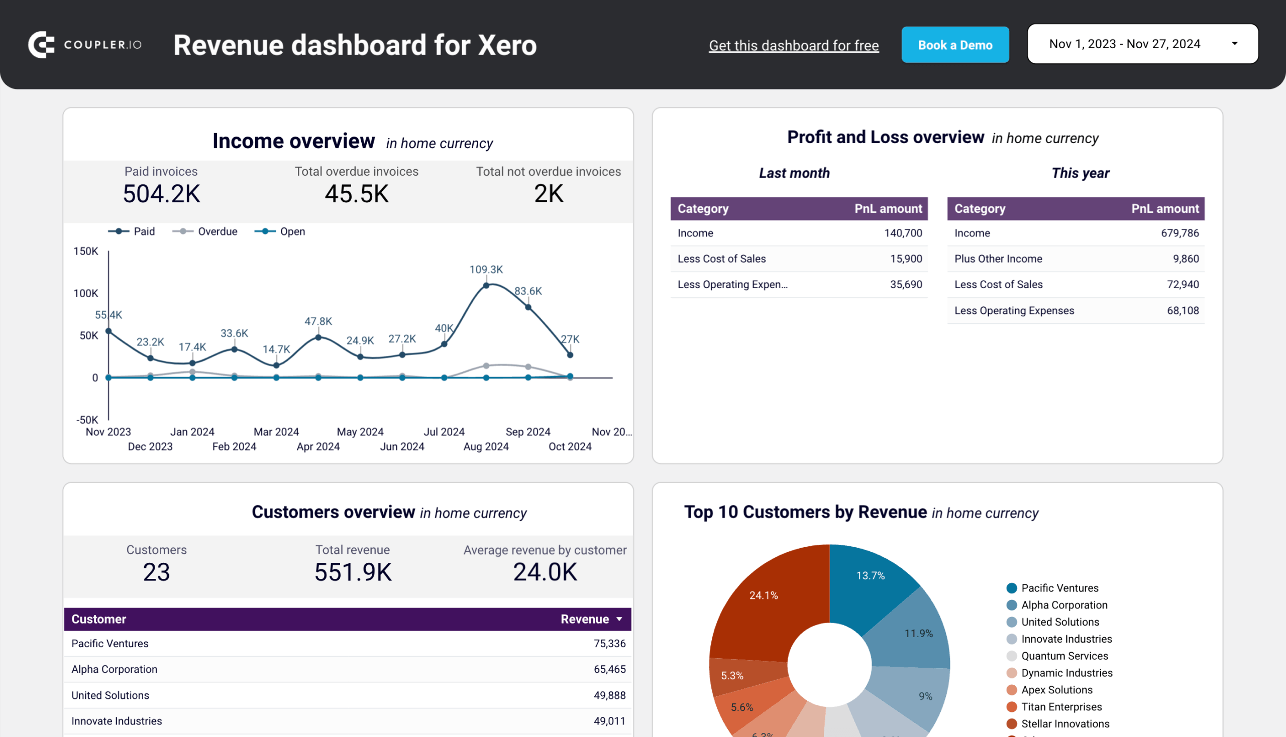
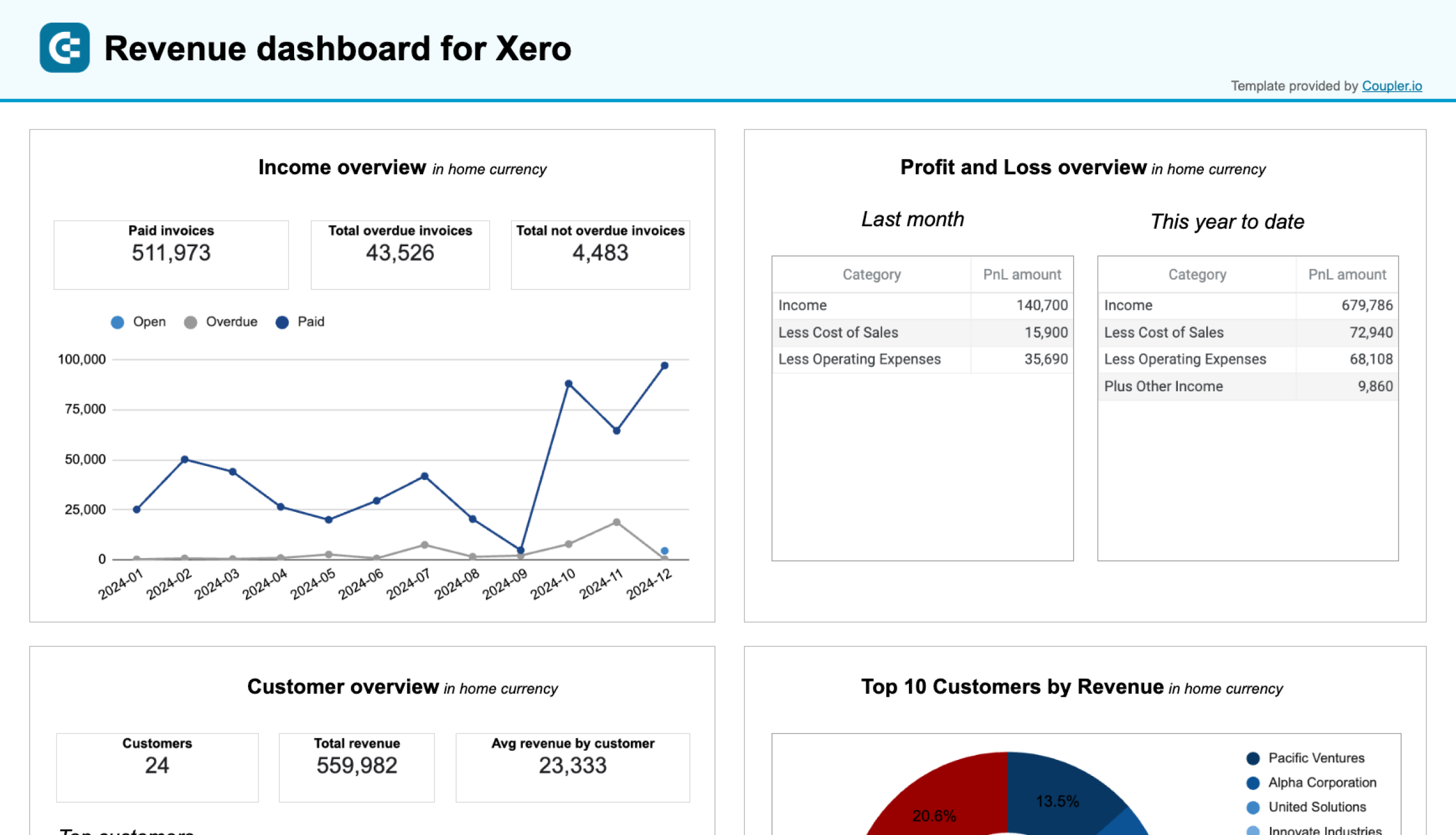
2. Revenue dashboard for Xero by Coupler.io
The revenue dashboard offers a clear snapshot of your business’s income and expenses. It’s one of the income statement reporting dashboards by Coupler.io to monitor financial performance and trends. It provides insights into revenue distribution, top-performing customers and products, and profitability, all in one place.
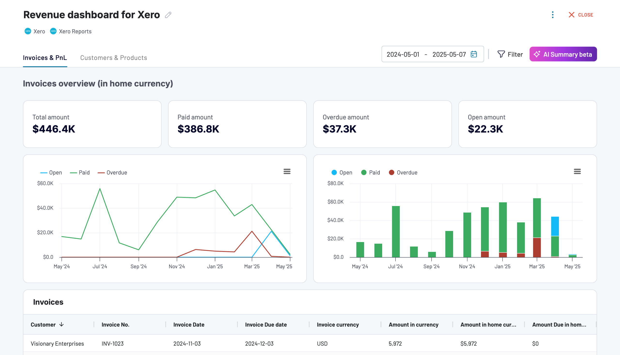
The dashboard features metrics and visualizations to track paid invoices, overdue amounts, and revenue trends over the last 12 months. You can also see a detailed breakdown of top customers and products by revenue contribution, enabling you to focus on key income drivers. The Profit and Loss section highlights how your income compares to costs, which makes it an efficient profitability reporting dashboard.
Key insights
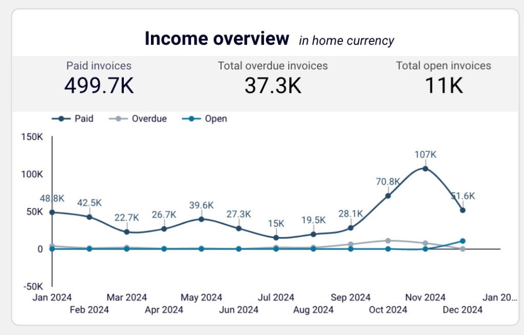
Income Overview
The line chart tracks total paid invoices, overdue invoices, and open invoices over the last 12 months. It helps you identify trends in payment collections, detect seasonal fluctuations in revenue, and spot any unusual dips or surges. For example, you can see how payments have fluctuated month-by-month and take action to address overdue amounts.
Profit and Loss Summary
The P&L dashboard section provides a breakdown of your income, cost of sales, and operating expenses. It shows your net profitability for both the last month and the current year, making it easier to analyze costs relative to revenue. This insight is vital for budgeting and financial planning.
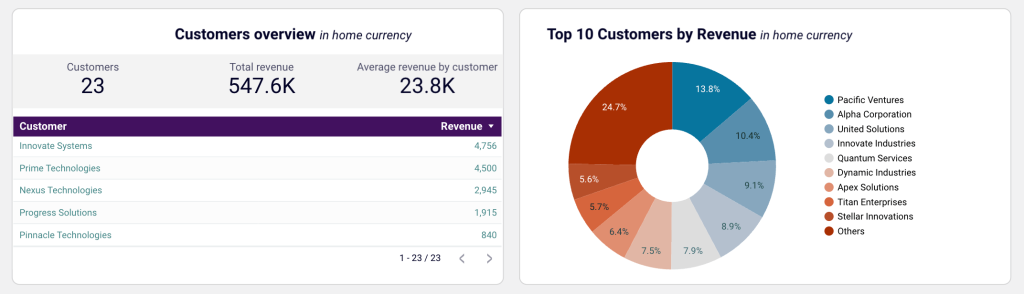
Customer Revenue
The dashboard lists your top customers based on their contribution to total revenue. This allows you to focus on high-value clients, develop targeted retention strategies, and identify opportunities to increase sales from key accounts. You can also track the average revenue per customer to assess the performance of your customer portfolio.
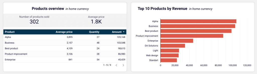
Product Revenue
The product revenue table highlights the best-performing products and services by revenue generated. You can identify high-demand offerings, manage inventory, and adjust sales plans to maximize income from your top products. It also pinpoints underperforming products that may require additional promotion or repositioning.
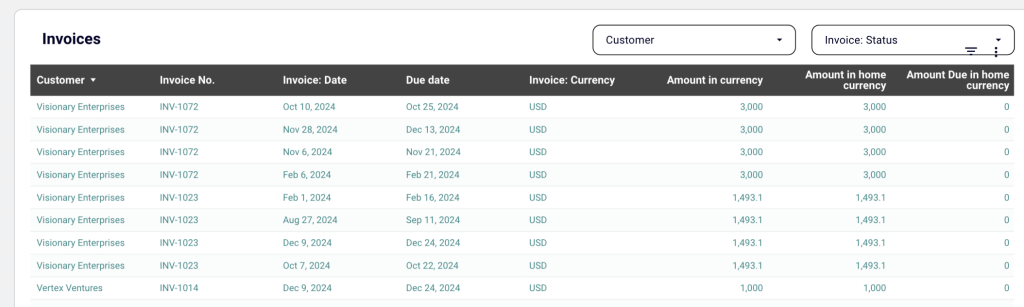
Invoice Details
A detailed table that provides invoice-level information–customer names, invoice numbers, dates, due dates, amounts, and statuses. It comes with filters for customer names, invoice dates, due dates, and payment status. These help you focus on specific data, making it easier to organize and prioritize payment collection.
How to use the report template
This template is also available in Coupler.io or as a template for Looker Studio and Google Sheets. The built-in connector lets you seamlessly integrate with your Xero account and populate the dashboard with your data. Follow the Readme instructions to set up the importer and visualize your financial performance easily.
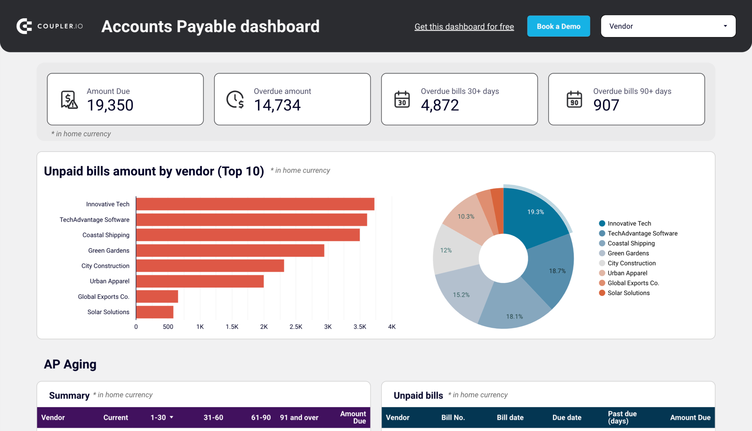
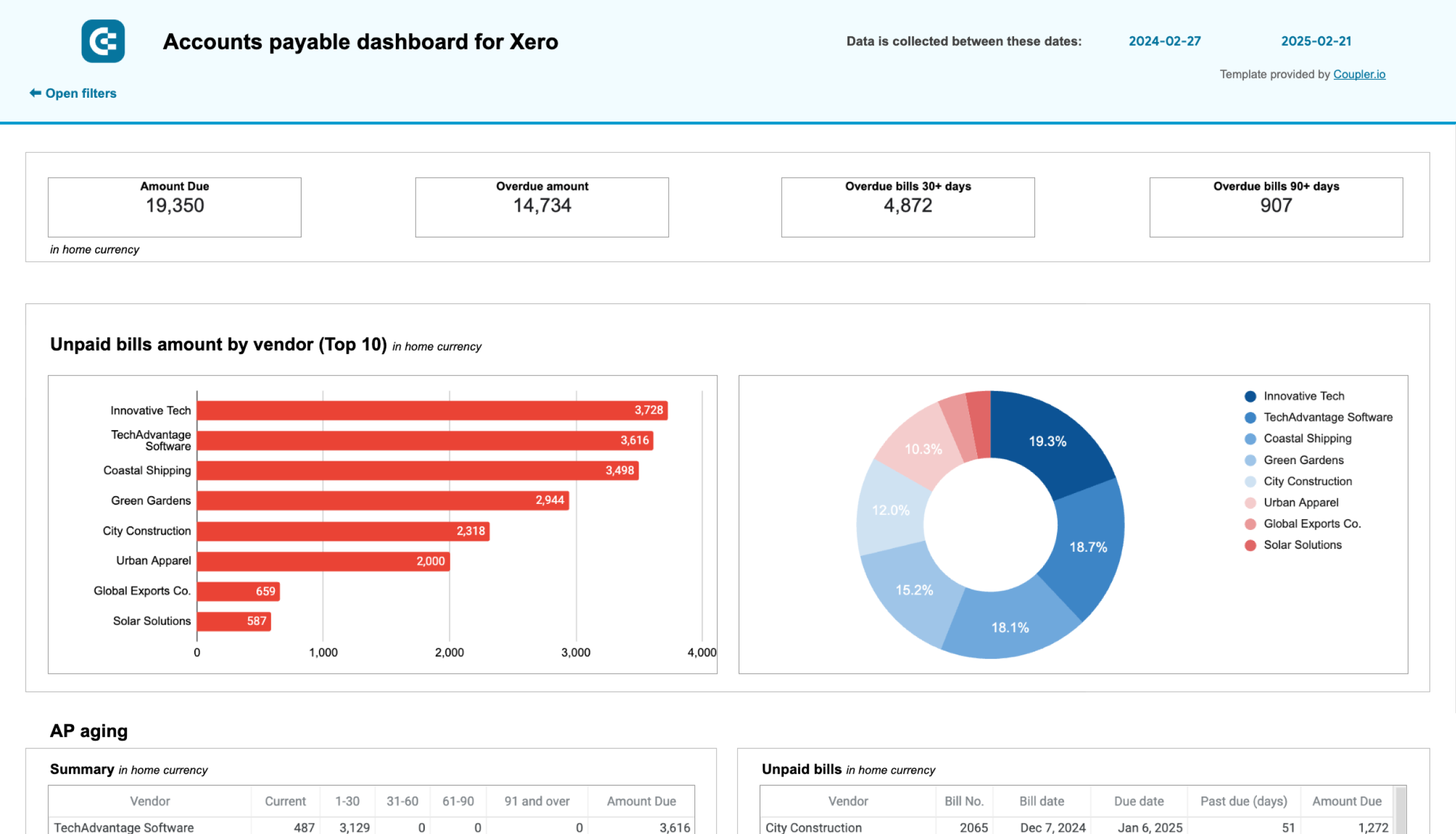
3. Accounts payable dashboard for Xero by Coupler.io
The accounts payable dashboard by Coupler.io provides an overview of your accounts payable. It includes metrics such as paid and unpaid bills by the vendor, bank summary, and account payable aging. This allows you to identify your top creditors, how much is due or overdue, your current balance, and more.
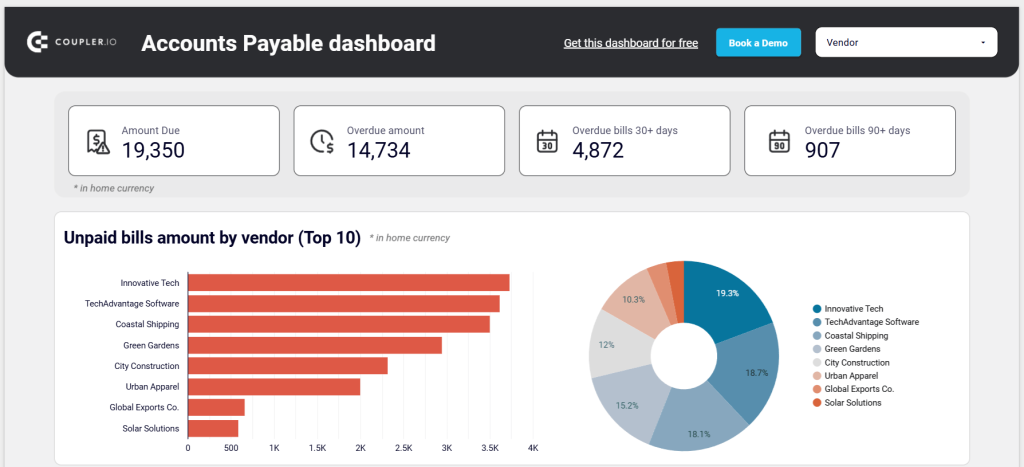
This accounting dashboard template is useful for small business owners and accounting professionals to track and prioritize vendor payments so they can clear payments on time and avoid delays and late fees.
Key insights
Unpaid bills amount by vendor
At the top, you can view the amount due, overdue amount, overdue bills in the last 30+ days, and overdue bills in the last 90+ days. Next, the bar graph shows the top 10 vendors by credit debt whose payments are due. To the right, the pie chart displays the percentage of unpaid amounts to each vendor in the total accounts payable.
Accounts payable (AP) aging
The table summarizes overdue amounts by vendor and period – current, up to 30 days, 31-60 days, 61-90 days, and 91 and over. It also shows the total unpaid bills by each vendor, along with a grand total of all the unpaid amounts.
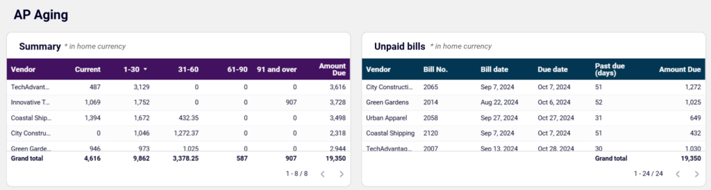
The table on the right shows vendors’ unpaid bills by bill number, bill date, due date, past due in days, and total amount due. You can apply filters, export the table (as CSV, Excel, and Google Sheets), and reset the table.
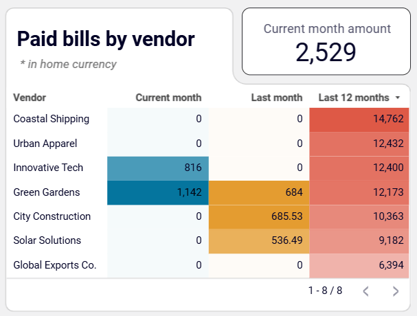
Paid bills by vendor
This section helps you understand how much you have paid to your vendors in the current month, last month, and year-to-date. It also lets you determine the amount paid to each vendor to prioritize payments to specific creditors. You can also get a sum total of the amounts for the current month, last month, and year-to-date.
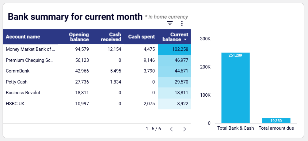
Bank summary for the current month
The table on the left shows the account names, opening balance, cash received, cash spent, and current balance in each account. You can filter this chart, export data as a CSV or Google Sheet, and reset the applied filters. The chart on the right shows the total bank and cash available and the total amount due. These insights help you distribute cash effectively and prioritize payments.
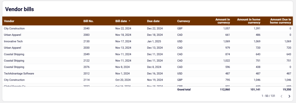
Vendor bills
This table shows vendor bill details such as vendor name, bill number, bill date, due date, currency, amount in currency, amount in home currency, and amount due in home currency.
How to use the Xero report template
The dashboard is available as a template in Looker Studio and Google Sheets. Each option has a built-in connector by Coupler.io to automate the data-loading process from your Xero account to this dashboard.
From the dashboard’s left panel, locate and click on the Readme tab. It has all the instructions you can follow to connect your Xero account, load data to the dashboard, and create your report. Get started quickly by signing up for free.
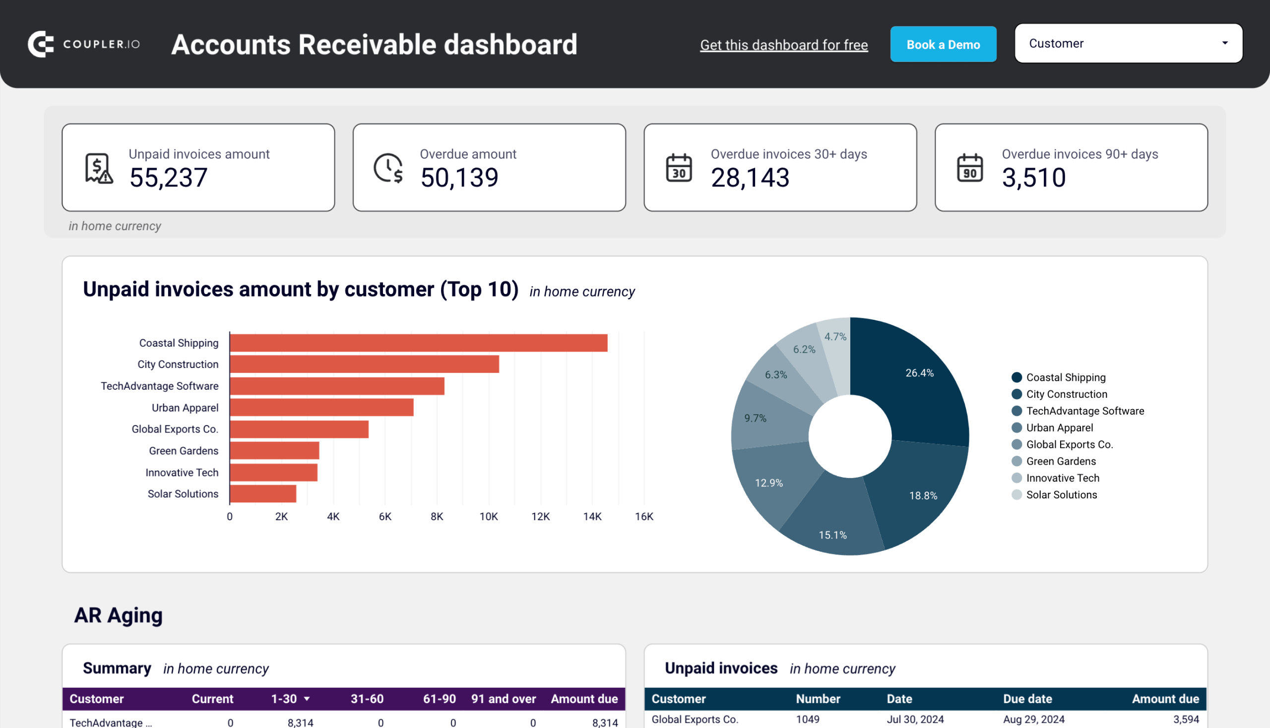
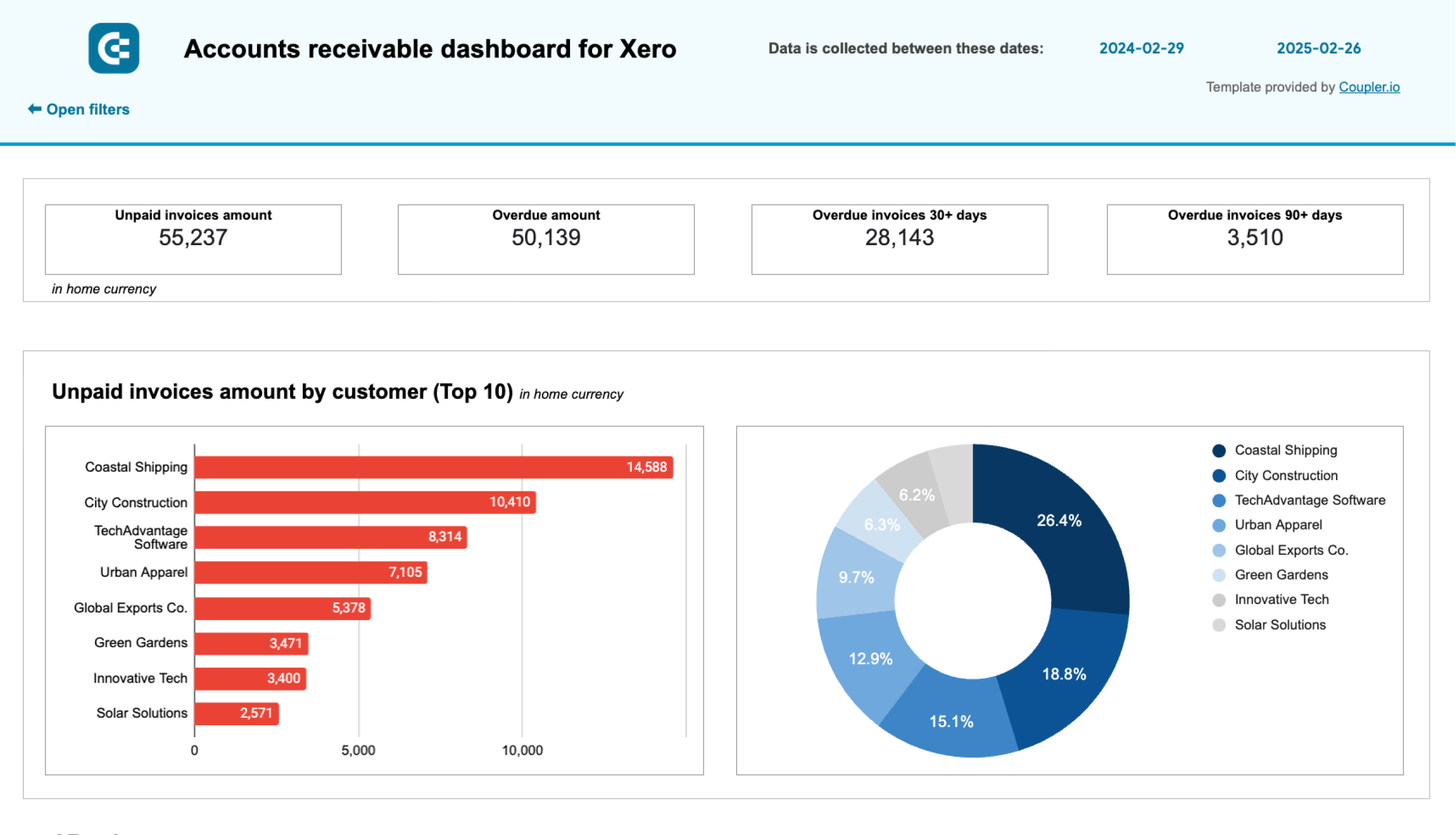
4. Accounts receivable dashboard for Xero by Coupler.io
The accounts receivable dashboard provides an overview of accounts receivable data to help you manage your unpaid invoices. It displays both paid and unpaid invoice amounts, account receivable aging, and more.
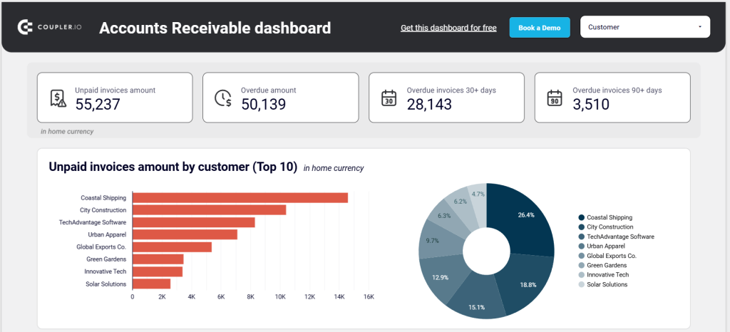
The insights provided by this dashboard allow you to identify who owes you and how much, find out your top debtors, prioritize payment recovery, and make better decisions on settling debts without friction. This way, you can uphold good relationships with customers while eliminating cash gaps.
Key insights
Unpaid invoices amount by customer
At the top, you can see metrics – unpaid invoice amount, overdue amount, overdue invoices in the last 30+ days, and overdue invoices in the last 90+ days. The unpaid invoices chart shows your top 10 customers or debtors. The pie chart displays the percentage of invoices due by each customer in the total accounts receivable.
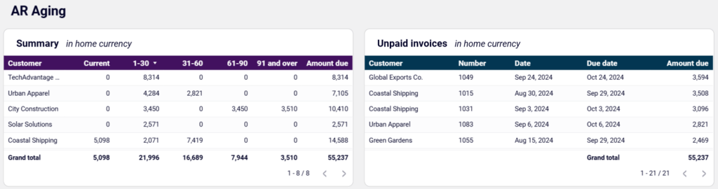
Accounts receivable (AR) ageing
This section displays the overdue amount distribution by customers and period (current, 1-30, 31-60, 61-90, 91 and over), and the total amount due for each customer. The unpaid invoices table displays client-level details – invoice number, date, due date, and amount due. In both tables, you can apply and reset filters and export the file as a CSV or Google Sheets file.
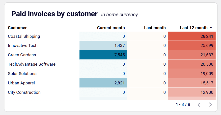
Paid invoices by customer
You can view the names of the customers and invoices they have paid in the current month, last month, and the last 12 months. This helps you identify your major customers based on the size of invoices they have cleared and prioritize payment recovery from them.
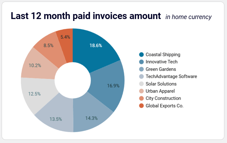
Last 12 months paid invoice amount
This section of the Xero report template has a pie chart showing the percentage of invoices paid by each customer in the total amount receivable in the last 12 months.
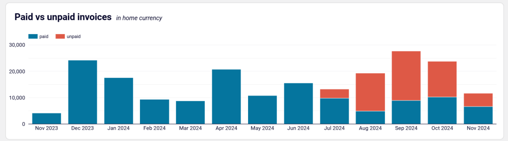
Paid vs unpaid invoices
The column chart under this section displays the paid and unpaid invoice amounts by your customers each month in the last 12 months. For example, you can see that 10,208 was paid and 13,589 was unpaid in the month of October 2024.
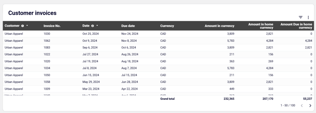
Customer invoices
This table displays the details of your customer invoices in the last 12 months, including customer name, invoice number, invoice date, due date, currency, amount in currency, amount in home currency, and amount due in home currency. You can also apply filters and export data in CSV and Google Sheets.
How to use the Xero report template
This report template is available in Google Sheets and Looker Studio. It has a built-in connector to automate the process of loading accounts receivable data from your Xero account. Go to the Readme tab from the left panel of this dashboard and follow the instructions to connect your Xero account, load data, and get your dashboard in no time.
5. Cash Manager Xero report template by Syft
This cash manager report template by Syft forecasts your cash positions daily and in the next 2-7 or 8-30 days. It helps you manage your cash and avoid cash flow surprises.
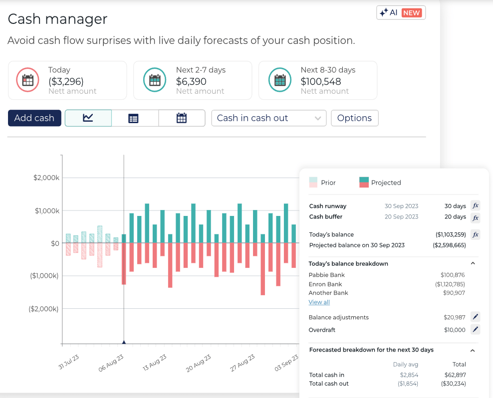
The report template can be customized with custom colors, graphs, and other elements. In addition, you can schedule automatic report sending every month and export your accounting reports to PDF, Microsoft Word, Excel, and Google Sheets.
Key insights
- Today’s net amount to understand where you stand in your cash deposits
- Net amount in the next 2-7 days to know the expected cash positions in the current week
- Net amount in the next 8-30 days to make decisions according to your cash positions in the current month
- A breakdown of your balance in each bank account
- Total cash-in and cash-out in the running month with daily average and monthly total
How to use the report template
You can only access the report template as a user of Syft. So, you need to create an account, use Syft’s connector to integrate your Xero account, and then load data to this Xero report template for detailed accounting analysis.
6. Xero report template by Spotlight
Spotlight’s cash movements template provides clear and detailed insights into how cash flows in an organization. This helps SMEs, Not for Profits, franchises, and CFOs improve their financial planning and decision-making. Accounting firms can use these templates to create data-driven reports in just minutes, allowing them to deliver excellent advisory services.
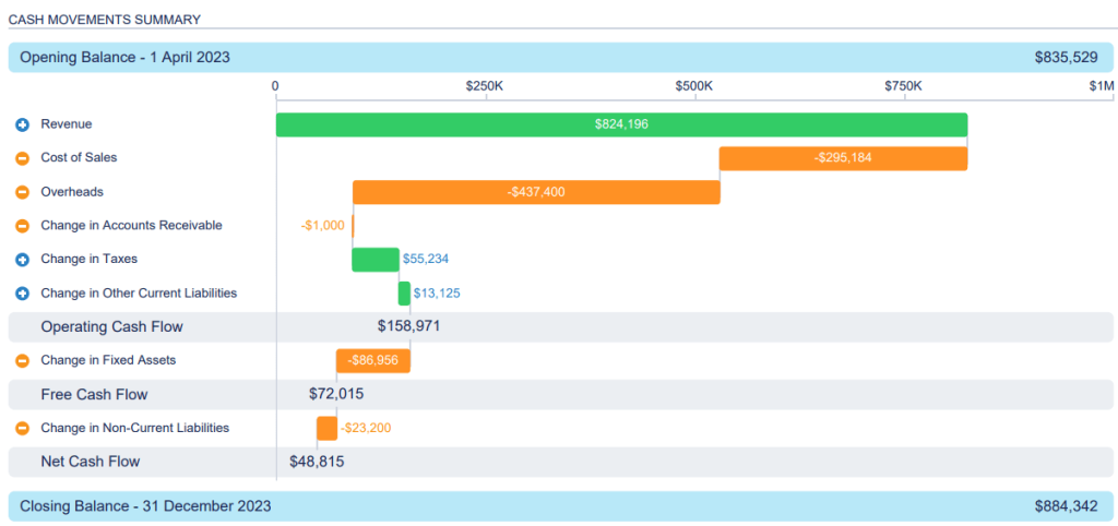
You can customize this report template according to your needs and preferences by utilizing Spotlight’s extensive chart gallery and visual graphs.
Key report insights
- Opening and closing balance for the chosen date range
- Revenue generated during the reporting period
- Cost of sales in the period
- Overheads in the reporting period, excluding taxes and dividends, depreciation, and amortization
- The change in accounts receivable from the opening date to the closing date
- Changes in taxes to track any changes in expenses or tax liability during the period
- Changes in other current liabilities to understand how your current liabilities move during the period, excluding tax liability, employee entitlements, and accounts payable
- Operating cash flow, which is the total revenue, cost of sales, overheads, changes in accounts receivable, changes in taxes, and changes in other current liabilities
- Changes in fixed assets during the period, excluding your deprecation expenses
- Free cash flow, which is operating cash flow plus changes in fixed assets
- Changes in non-current liabilities, calculated by adding up this month’s non-current liabilities to that of last month
- Net cash flow in/out of your business during the reporting period, a sum of free cash flow and changes in non-current liabilities
How to use the report template
This template is not available for non-Spotlight users. To use it, you need to first create an account, then import your Xero data to the reporting template.
7. Month end P&L reports by Joiin for Xero
Joiin’s month end P&L report template allows accounting advisors, business owners, CFOs, and individuals from finance firms to track profits and losses in a specific accounting period.
You can customize this report using visual elements, such as charts, graphs, and graphics. View data in your preferred report format and invite your team members to view and collaborate on reports effectively.
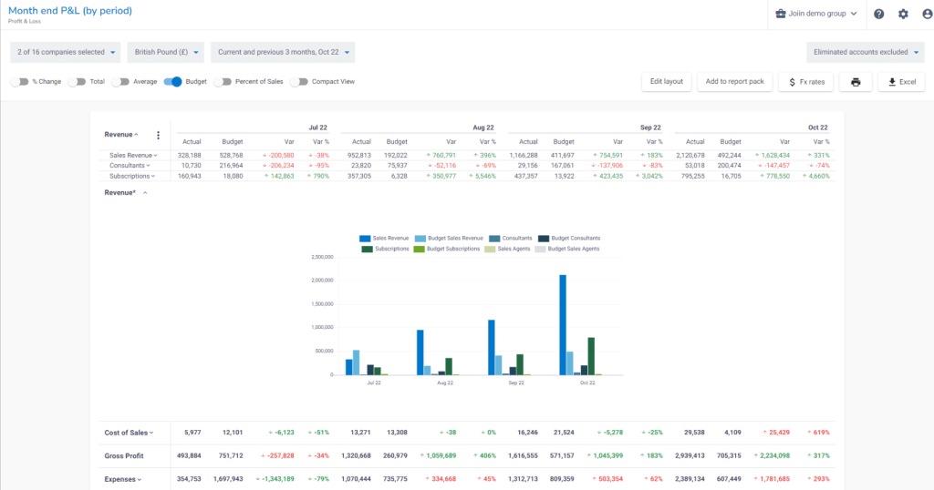
Key insights
- Revenue in each month, along with sources, such as subscriptions and sales actual revenue, budget, variation, and variation percentage
- Cost of sales in a month with actual cost of sales, allocated budget, variation between the two, and the variation percentage
- Gross profits in a month with values for actual gross profit, budget, and variation between the actual spend and the budget
- Expenses in a month with values for actual expenses, budget, and their variation
Calculating the variation between the actual and budget values will help you track how much profit and expense you have made in a month.
How to use the report template
To access the report, you must have a Joiin subscription plan. So, you’ll need to create an account, and then load your Xero data to the report template. You can easily customize the report based on time periods, accounts, and departments.
Should you use Xero’s free built-in accounting report templates?
Xero HQ offers plenty of professional-looking and flexible accounting report templates for free. Some of the built-in templates in its vast library include:
- Balance sheet template provides a snapshot of your finances, including owner equity, assets, and liabilities.
- Cash flow statement template helps you track expenses and cash receipts to understand how cash flows in and out of your organization and make better budgeting decisions.
- Cash flow forecast template helps you predict how much cash will be in your bank account next week, month, or year by tracking sales invoices, cash flows, and revenue and expenses,
- Profit and loss template summarizes income and expenses in a financial period by measuring net profit and loss before taxes.
- Expenses template helps you categorize and track expenses like salaries, reimbursements, rent, resources, etc. Use it to make mindful investment decisions.
- Invoice template lets you create professional-looking invoices with details like invoice number, date, taxes, bank details, etc. Use it to instruct your customers to make payments through additional notes.
- Payslip template helps you create payslips for your employees with details, such as earnings, deductions, reimbursements, etc.
- Receipt template to manage your receipts with details, such as items, client data, business contacts, short descriptions of items, tax details, etc. It’s useful to avoid hassles with manual spreadsheets.
You can customize these templates to suit your accounting needs by changing formatting and ordering, adding formulas, editing content, text blocks, layouts, titles, dates, and more. Furthermore, you can share your reports by exporting them as PDFs or spreadsheets, or by email for detailed analysis.
Sure, you can use native templates for your accounting reporting in Xero. However, if you are looking to get a more detailed, granular outlook on your accounts, opt for custom templates available from providers, such as Coupler.io.
How to create custom Xero reports
Every business is different, hence, standard reports may not align with your reporting needs. Creating a custom report allows you to include certain metrics in the report to track them. You can also add visual elements to analyze data effectively and share reports with your team for better financial planning. Here’s how to create custom Xero reports using Coupler.io:
Step 1: Collect data
Start by choosing a destination app for your custom report in the form below and click Proceed.
You will be offered to sign up for Coupler.io for free without the need to enter any credit card details.
Enable access to your Xero account and select Xero tenant, data entity, and report type to export your data.
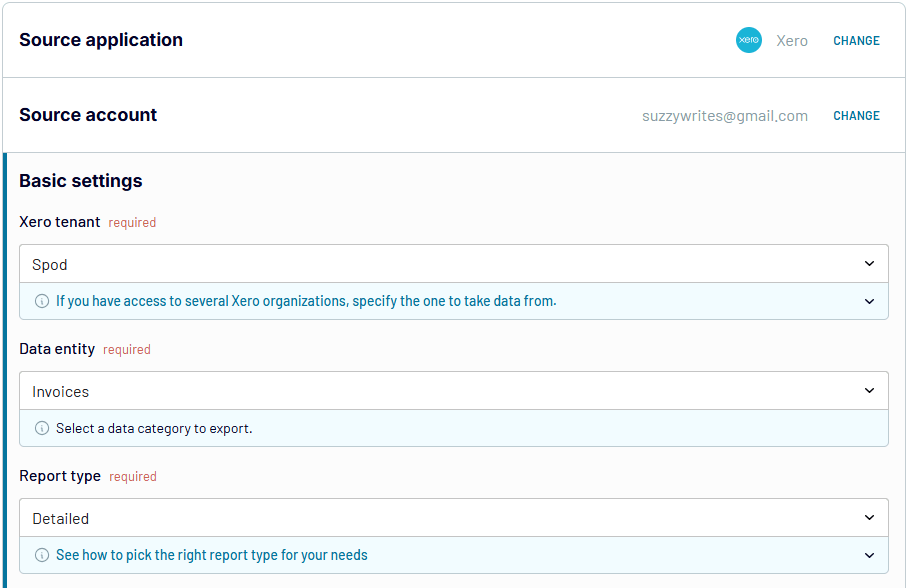
Note: Coupler.io also enables you to export reports from Xero. For this, the change Xero source application to Xero Reports.
Step 2: Preview and modify data
You can preview your data for verification and modify it if needed. Coupler.io allows you to:
- Apply filters and sort data
- Edit and hide columns
- Add new columns using certain formulas
- Merge data from different Xero accounts
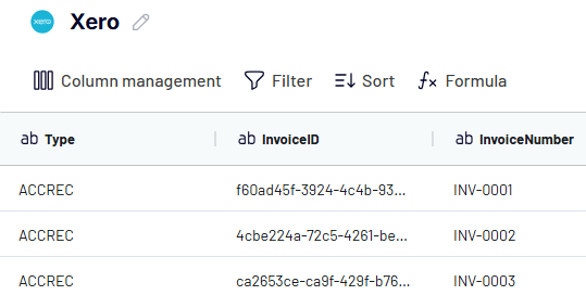
Coupler.io also allows you to combine data from multiple Xero accounts or other business apps.
Step 3: Load data and schedule refresh
Follow the on-screen instructions to load data from Xero to the selected destination app.
Next, enable the Automatic data refresh and set up a schedule to make your custom Xero report self-updating.
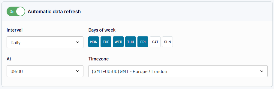
Scheduling automatic data refresh ensures you always get the latest data automatically in your accounting reports to make effective financial decisions.
Why are Xero report templates important for modern accounting?
Xero report templates make the accounting process easier by allowing you to start quickly without needing to design reports from scratch. They save you a significant amount of time whether you want to analyze cash flow, balance sheet, profit and loss, or gain other financial insights. Quick access to valuable data helps you manage your finances efficiently and improve your financial decision-making.
If you are a small business owner or accounting professional looking to automate financial reporting, check out Coupler.io’s Xero report templates for accounts payable and accounts receivable.

Automate Xero reporting with Coupler.io
Get started for free